Haha, righto. As I type this I notice the Quick-Reply font size to be bigger than the forum's default post font - nothing major. Maybe a keeper if everyone feels comfortable with it? I think it'll take getting used to for long posts ^ ^.
You are using an out of date browser. It may not display this or other websites correctly.
You should upgrade or use an alternative browser.
You should upgrade or use an alternative browser.
New Look to SKnet
- Thread starter Walter
- Start date

Grail
Feel the funk blast
Definitely digging the new layout! The added contrast gives it a much sleeker look, and previewing posts is a lot easier now.  I'll admit that for a second I was worried because the oekaki link was gone, but it's still in its usual spot. Thanks for spending so much time making the site better, Walter!
I'll admit that for a second I was worried because the oekaki link was gone, but it's still in its usual spot. Thanks for spending so much time making the site better, Walter!Two small suggestions:
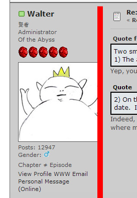
1) The avatar in the upper right of the page header is cropped quite a bit. Not sure if this is intentional but it looks a little funky.
2) On the main forum page, on the right side, wherever it says "Last Post." This is now always a bolded font, making it a little difficult to spot new posts that have a bolded "Today" date. I believe the old site didn't have this "Last Post" bolded and was a little easier to note the updates.
Nit picks really. Liking it so far.
Yep, you'll also notice your avatar in this page is also cropped from the right side. It sucks, but it's just one among many things that need fixing.ApostleBob said:Two small suggestions:
1) The avatar in the upper right of the page header is cropped quite a bit. Not sure if this is intentional but it looks a little funky.
Indeed, good eye. I'll be changing that stuff around. I want that to be a simple, easily clickable link to go to the thread. There's no need to have all that clutter in that section, since that's where most people click to view the latest thread activity. Should be streamlined for sure.2) On the main forum page, on the right side, wherever it says "Last Post." This is now always a bolded font, making it a little difficult to spot new posts that have a bolded "Today" date. I believe the old site didn't have this "Last Post" bolded and was a little easier to note the updates.


Vampire_Hunter_Bob
Cats are great
I'm afraid it's not as easy to fix at it looks. But yeah, like I said I'm working on it. Your Simpsons avatar will soon be visible in ITS FULL GLORY.Vampire_Hunter_Bob said:UGH! Walter get off your lazy butt and fix this!
Along the way, I've also fixed the logo, and re-added the quick-search bar at the top.
Edit: F I X E D
Vampire_Hunter_Bob
Cats are great
O.M.G. Walter! You don't know how much that cut off arm has been killing me!Walter said:I'm afraid it's not as easy to fix at it looks. But yeah, like I said I'm working on it. Your Simpsons avatar will soon be visible in ITS FULL GLORY.

Excellent work.Edit: F I X E D

I also wanted to point this out because I noticed it on my phone:
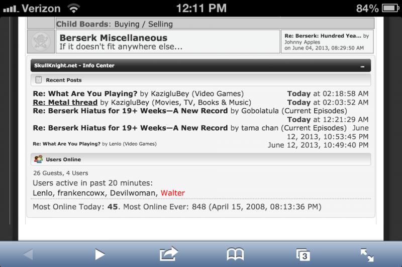
Which is the varying sizes of the thread titles listed in 'Recent Posts.' I'm not sure if this is because I'm not logged into sk.net on my phone or if it's a feature for phones. Either way, I'm wondering how the forum decides what thread titles are listed in the larger font and what thread titles are listed with smaller font.
Griffith
With the streak of a tear, Like morning dew
I am totally open to suggestions on that.Griffith said:Can we make inserted hyperlinks more distinguishable? I've always had a problem with this, and maybe I have trust issues when it comes to people noticing the links I sprinkle throughout my posts, but right now the links are literally showing up as black on dark gray. =)
I don't think it's better than it was quite yet. But it will beOburi said:It took some getting use to but now I LOVE the new layout. I can already tell the Volume listing tab is going to come in handy a lot too.

Walter said:Yep, you'll also notice your avatar in this page is also cropped from the right side. It sucks, but it's just one among many things that need fixing.
Walter, I've noticed this issue still popping up on some of the avatars. Maybe a proportions issue for the images but its still happening for some peoples profile pictures.
Ugh... I'll work on it.ApostleBob said:Walter, I've noticed this issue still popping up on some of the avatars. Maybe a proportions issue for the images but its still happening for some peoples profile pictures.
Click your name then on sidebar click View Posts. For you, the link is: http://www.skullknight.net/forum/index.php?action=profile;area=showposts;u=4184Oburi said:How can I view all my own recent posts?
Oburi
All praise Grail
Walter said:Click your name then on sidebar click View Posts. For you, the link is: http://www.skullknight.net/forum/index.php?action=profile;area=showposts;u=4184
I'm not seeing it. I see it on other peoples profile but not on my own.
Try now.Oburi said:I'm not seeing it. I see it on other peoples profile but not on my own.
Oburi
All praise Grail
Walter said:Try now.
Giddyup
Am I the only one experiencing bogged down load times? Other sites that I frequent are loading the same as usual, which causes me to single out this one. And I was hoping that it would pass before I said anything, but it's been happening to me for a few days now.
Using Chrome as a browser. Could that be an issue? I'm on the east coast. Could it be a server thing? I don't know much about these things. Or if it's even related to this thread for that matter.
Using Chrome as a browser. Could that be an issue? I'm on the east coast. Could it be a server thing? I don't know much about these things. Or if it's even related to this thread for that matter.
I experience it in the morning, on and off.