LOicos said:
I am not a fan of that cover.
LOicos said:
Walter said:Also there's something off about the colors here. Miura generally (always) paints his covers. This one doesn't look painted, or if it is, it's hard to tell given the resolution. I wonder if this is his colorization or someone else's?
Walter said:I think it was quite brave to NOT put Goura on the cover. I've been pretty vocal about this on the podcasts, but I think Goura's design and the episodes that feature it are the standout pieces of Gigantomakhia.
Walter said:I expect that other color image of Prome will end up as a poster. If so, wonder what the reverse side will be..?

【ギガントマキア】
先日ご紹介した三浦建太郎先生直筆『ギガントマキア』の色紙ですが、黒木書店名島店さんのレジカウンター内に飾っていただいております。
お近くにお住まいの方は、ぜひお出かけください!


Johnny Apples: 1 | Foreshortening: 0Johnny Apples said:The way Delos is depicted on the tankobon cover art in a way reminds of the way Guts was on the first volume of Berserk, which in of itself wasn't exactly the best of Berserk covers. You only see the head, and the cloak-covered shoulders. Nothing else. The rest of the body is absent altogether.

Ouch! To be fair, I think Miura still exercises his trademark skill in this cover, which might not be as obvious right now due to the lower resolution. The details in Prome's face, for example, are very delicate. I think that he was trying to do something different and it backfired a bit. It's too bad that it didn't work out, but I do like that he continues to experiment with the limits of his skill as an artist. I think that's a good sign.Johnny Apples said:I expected the Gigantomakhia cover art to feature Delos and Prome. But I didn't think it would be something so drab and unimaginative. From Delos' goofy facial expression, to the overhead point of view of the two characters and the complete absence of background art... it's just wrong and is not contextually or stylistically representative of the great story contained within. In fact, if I was randomly shown that cover art without being told beforehand that it is Miura's work, I'd think that this must be some mediocre shonen manga by a no name author. I just refuse to believe that Miura himself would have come up with something so paltry looking

Grail said:Ouch! To be fair, I think Miura still exercises his trademark skill in this cover, which might not be as obvious right now due to the lower resolution. The details in Prome's face, for example, are very delicate. I think that he was trying to do something different and it backfired a bit. It's too bad that it didn't work out, but I do like that he continues to experiment with the limits of his skill as an artist. I think that's a good sign.

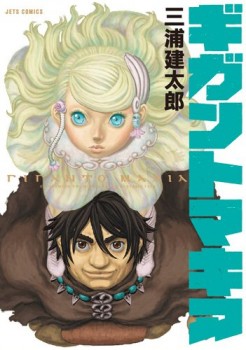

Johnny Apples said:But Delos? On that cover, the poor guy's face hardly resembles how he originally looked in the manga. He appears much more cartoonish, and far less three dimensional here than he is in the manga. His head is very round and looks smaller than it's supposed to be, and combined with the weird facial expression and the way his eyes and facial features are shaped and sized, ironically enough, he's the one who ends up appearing more child-like.
Johnny Apples said:And I think this is what bothers me and many others about this particular cover.
Johnny Apples said:Miura, having mastered throughout his career all the ins and outs of his craft, he knows how to draw anything and everything, from video game covers to postcards. He could have easily come up with something far better than this

Hmm, is it some kind of special edition of the cover? I dont mind the green on the eyes and logo but the hair and dress seems a little too much unless its suppose to look different in person. Glow in the dark maybe? Having the logo and Prome's android-like eyes glowing in the dark staring at you, that'd be pretty neat.IncantatioN said:Young Animal's Facebook page showed the cover in a slightly different color.

