Vax's Colors

Vaxillus

The one and only severed head
Well, for once I actually made an effort to step up the pace here, and guess what happens: My summerschool smashes me in the face with a 2x4 worth of homework. Made me miss the new episode party too :judo:. I'm caught up now though, so here's an update.

http://www.lithrael.com/ig/albums/userpics/10011/ZZZZZAP1.jpg

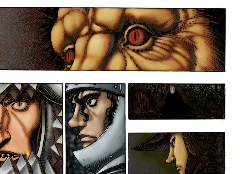
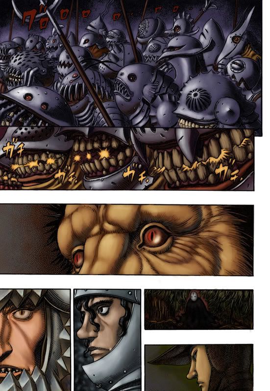
This is the first panel of what will eventually be a fully colored page. I really have to thank Lith for this one, since it's not only hosted on her site but she provided the lovely scan. It was so large, in fact, that I decided it would be safer not to post the image directly, so you may want to just download it and look at its complete form with an image viewer.

I'll probably touch it up a bit later since it's very messy, but I wanted to get something posted.

Other stuff:
First of all, thanks to CnC for your advice with the sketchy pannels, I'll keep that in mind in the future. The lighting will definately come into play later, I'm starting to get the hang of things now.

Finally, in a show of shameless self promotion, I'd like to show this off:
http://static.flickr.com/65/174870675_33f50540f1_o.jpg

It may not look so hot close up, but it might be a bit more impressive when you take into account the fact that it's only 34 mm tall. In any case, it won Bronze at a convention I went to. It's my first contest, hence the shameless bragging.
 

CnC

Ad Oculos
I like it! Good job. Interesting choice of coloring on the boat.

not much to crit. maybe add some highlights to places you'd want to draw attention to? maybe? dunno. It works as it is.
Good stuff.

I'm a bit confused about the statue. did you make that?!
if so, great work!
 

Vaxillus

The one and only severed head
Yeah, it was just colored. I do a bit of sculpting myself, but I'm nowhere near that good. Maybe someday. Anyway, you might be surprised at how popular the hobby is, but I'd assume you have to be involved with gaming (not including video games) to have heard of it.

Anyway, thanks for the coments. I'd try to pick out a focal point, but I wasn't really sure where to make it. His face isn't really visible (speaking of which I just realized I didn't color his chin and neck), and there's nothing else that I can find that would work. The wood is a bit funky, I think I'll darken it around the edges a bit to provide some more contrast and try to make it a little more uniform with the highlights. Anyway, looking at it this zoomed in I have quite a bit of cleanup on this piece, I'll post again when I have some more of the page colored.
 

IsolatioN

Last Soldier Standing
Very nice colorings, Vaxillus. Out of curiousity, is that miniature from Warhammer 40k? I used to really be into WH 40k, had a great Necron army..

/nerdiness
 

CnC

Ad Oculos
Vaxillus said:
Yeah, it was just colored. I do a bit of sculpting myself, but I'm nowhere near that good. Maybe someday. Anyway, you might be surprised at how popular the hobby is, but I'd assume you have to be involved with gaming (not including video games) to have heard of it.

Ah, I see. Well, its a good paint job. I suck at that sort of thing, personally.

Vaxillus said:
Anyway, thanks for the coments. I'd try to pick out a focal point, but I wasn't really sure where to make it. His face isn't really visible (speaking of which I just realized I didn't color his chin and neck), and there's nothing else that I can find that would work.

focal points don't have to be a face. I'd say the point of the panel is to illustrate Guts being zapped, so perhaps the lighting could stand a bit of punch in brightness? Lighting photographed is usually bright white, so why not make the lighting glow a bit more? I didn't notice the chin and neck, but I'd leave them be since too much variation in color will be distracting.
Just my two cents. Its looking good.

ubik_angry.gif

Keep posting!
(hey aaz, its now my seal)
 

Vaxillus

The one and only severed head
IsolatioN said:
Very nice colorings, Vaxillus. Out of curiousity, is that miniature from Warhammer 40k? I used to really be into WH 40k, had a great Necron army..

/nerdiness
[gamingnerdrant]Games Workshop has become a bunch of price-hiking child-addicting vultures who have yet to realize that they no longer have a monopoly. I used to play their stuff too, but lately I can't even bear to considder it. In other words, same hobby, different company, and I probably paid about 1/3rd of the price for a superior figurine[/gamingnerdrant]

Anyway, I'll finally have a bit of free time tomorrow, so I'll get to work again. Thanks for the advice (again).
 

Vaxillus

The one and only severed head
Time for a new one!

ZZZZZAP2.jpg

This is the rest of the page I posted before with a bit of revision added for good measure.  I'm mostly happy with it, but I'd really like some feedback as to how to improve it.  A huge thanks to Lith for the great scan, though I'm not sure I've really done it justice.

I know this submission is extremely late, but there is a reason for this.  Some of you may have noticed my near absence from these forum for the last few months, or maybe not since I usually just spam the chattin' board  :carcus:.  Anyway, I've been completely bogged with homework for that past two and a half months and just finished my classes last week.  To give you a sense of how busy I was, I had to complete an acrylic on canvas (17"x22" or so) in a day, and this was one of the major projects so it couldn't look like crap.  Nonetheless, I'm back until I leave next week for normal school, hopefully my new design and color theory skills will reflect in my colorations.

Finally, let me advise all you aspiring artists against taking any online art classes.  Trying to scan a 17x22 piece of drafting vellum into a scanner which has a maximum capacity of 8.5x11 is a recipe for lots of stupid. :chomp:
 

CnC

Ad Oculos
Heey vax, whaaaats happenin'?

I like it! its a solid page. The first panel looks pretty damn good, imo. The bloom on portions of the lighting works well.
The 2nd and 3rd could use a little more contrast on the focal points, imo. The lighting is a biiiit too overpowering on them.

The fourth needs the most work, imo. Theres entirely way too much purple, or at least its too strong in the panel. Overall I think it could use more depth too. The figures seem to lack a light source.
That one needs the most work.

But overall good work. Keep on kickin' ass.
 

Lithrael

Remember, always hold your apple tight
Gorgeous!!! Yeah, the purple's too saturated, just grey it down a little and it'd be fine. Roderick's armor makes me wanna shoop. I'm shooping right now. Magnifico's hair could use a lil more variation, just cause the rest of the panel foreground is so freaking gorgeous it looks flat by comparison (could just be my monitor though). :guts:

First rate work! Cheers!!
 

Vaxillus

The one and only severed head
Thanks for the kind words and critiques. The pruple definately is a little crazy, I'll try to adjust it when I have a chance. I also see what you mean by Magnifico's hair being flat, which I blame on me zooming in way too far. I'll probably end up tweaking the whole thing a bit. One thing that's been bothering me are the screentones on Guts and Schierke when they're gettin' all ethereal, it makes their skin look blotchy. I blame the lack of propper contrast on that, though I know it's easily fixed. And just for the record, that lightening was a BITCH!

Anyway, I still have a ways to go. More to come later.


P.S.: What does 'shoop' mean? I hope it's good. :???:
 
I think Lith meant 'shop'  instead.  :serpico:

Anyways, nice coloring Vax.

Lithrael said:
Eheh, 1993 pop culture reference, 'shoop' lit. "to have the sex," used here for attempted comedic flavor.

-Edit- Assumption FTL  :judo:
 

Lithrael

Remember, always hold your apple tight
Vaxillus said:
P.S.:  What does 'shoop' mean?  I hope it's good. :???:

Eheh, 1993 pop culture reference, 'shoop' lit. "to have the sex," used here for attempted comedic flavor.
 

TheSkyTraveller

Monster adventures on the high seas!
Well, I don't have much new to add that hasn't already been said, but I wanted to say I really love the panel of Guts and Schierke. Nice work!
 

Vaxillus

The one and only severed head
Hey guys, been a while since I did one of these. I'm now going for a BFA in illustration, so I know a little more about what I'm doing. Still have a ways to go before I'm comparable to the big boys and girls of this board, but I think this craps on my previous work.
19.jpg

Crits welcome. I'm planning to do the whole page when I have time, this was more of a warm-up. When I do work it a bit more I think Locus's armor could use a bit of work (& Gurunberd's mouth area looks a bit flat too).
 

Serpico

Farnese is the bomb diggity
Nice work Vax. Locus is impressive. I would put a little more gleam in zodds eye. It should look slightly glossy or wet at that distance.
 

Vaxillus

The one and only severed head
Serpico said:
Nice work Vax. Locus is impressive. I would put a little more gleam in zodds eye. It should look slightly glossy or wet at that distance.
Doh! I was even planning on doing that, but it totally slipped my mind.
 

Lithrael

Remember, always hold your apple tight
unf. super hot. This is seriously just plain gorgeous.

I just started the page with Sonia, mind if I steal the look of your lighting? :idea:
 

Vaxillus

The one and only severed head
Lithrael said:
unf. super hot. This is seriously just plain gorgeous.

I just started the page with Sonia, mind if I steal the look of your lighting? :idea:
I'd be honored. :guts:
 

CnC

Ad Oculos
Very nice work, Vax!

I really like the tones used on Zodd and Locus, in particular. And the work done on Grunbeld's armor is very cool. Rakshas kind of gets lost in the page a bit so I'd do something to help bring that panel into the page more.
As what was suggested earlier, a highlight on the eyes would sell them as glossy.

Keep 'em coming! :guts:
 

Vaxillus

The one and only severed head
Ok, thanks for all the crits as usual. Here's the finished piece, a bit later than planned thanks to my college's movie network playing Cloverfield while I was trying to work on it. I'm not completely happy with the top pannel, it came out too blue and lacks any sort of contrast, especially compared to the one below it.
19Final.jpg


Also, a note on how to get a slightly more glowy effect in a piece without breaking your back. Once the image is complete, flatten it and duplicate it in a new layer (select all, cut and paste). Go to Filter>Blur>Gaussian Blur and blur it as much as you want. Set the Layer mode to 'Overlay' or whatever else strikes your fancy and turn the opacity down to 25% or so. This tends to add another layer of color to the piece and gives it a 'glow' that isn't attainable by merely adjusting the levels. It's easy to tweak the method to something more suitable to the project as well, bumping up the contrast and otherwise finishing the piece before or after doing this.
 
Great coloring imo !

i'm impressed how you made progress !

I'm beginner, but I think you chose the well colors, faces seem so real
 
Top Bottom