You are using an out of date browser. It may not display this or other websites correctly.
You should upgrade or use an alternative browser.
You should upgrade or use an alternative browser.
Proj's colors
- Thread starter Lithrael
- Start date
handsome rakshas
Thanks Grail!
Proj2501 said:
Very nice, Proj! Next do a Rakshas! Please?

Handsome...I promise I'll do a Rakshas soon! As for the shiny skin...yea for some reason when i was doing it i just thought Zodd (or Zod as Aaz would say  ), should just be lookin a lil shiny in that pic. I guess it was just an interpretation. I'm workin on Casca and the moonchild at the moment, then going to finish one of my older projects before a certain admin boots me.
Later Skull Knighters!
), should just be lookin a lil shiny in that pic. I guess it was just an interpretation. I'm workin on Casca and the moonchild at the moment, then going to finish one of my older projects before a certain admin boots me. Later Skull Knighters!
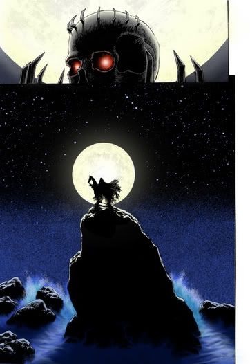
Casca and moon child....i feel eh about it...
http://www.lithrael.com/ig/displayimage.php?pid=323&fullsize=1
http://www.lithrael.com/ig/displayimage.php?pid=323&fullsize=1
 Your new avatar is pretty slick, too (although a tad wide, but whatever).
Proj2501 said:Casca and moon child....i feel eh about it...
I like it. Perhaps the reason you feel "eh" about it are twofold. I think the blue cloth is _very_ saturated given the scene depicted (even bright moonlight wouldnt let stuff glow like that). Secondly is that its too uniformly lit. Thats not to say that shadows and such arent indicated, just that the shadows arent dark enough given, once again, the scene depicted. So I think youll like it a bit more with darker shadows. Perhaps to sell the moonlight you can give it a cooler color cast.
That said, I like the skin tones, and your technical ability has increased a hundred fold since you started. Great work. Keep at it.
CnC said:I like it. Perhaps the reason you feel "eh" about it are twofold. I think the blue cloth is _very_ saturated given the scene depicted (even bright moonlight wouldnt let stuff glow like that). Secondly is that its too uniformly lit. Thats not to say that shadows and such arent indicated, just that the shadows arent dark enough given, once again, the scene depicted. So I think youll like it a bit more with darker shadows. Perhaps to sell the moonlight you can give it a cooler color cast.
That said, I like the skin tones, and your technical ability has increased a hundred fold since you started. Great work. Keep at it.
Thanx for the critique. I was wondering....can u possibly show me what u mean...not to be a pain in the ass. If you could I'd appreciate it. Only because I'm really tryin to improve.....so i'd be appreciated!!! thanx
Proj2501 said:Only because I'm really tryin to improve.....so i'd be appreciated!!! thanx
Your contributions are always appreciated, not to mention they look cool!

This is a rough idea of what I'm getting at (really rough).
1st frame is your pic
2nd frame is pic with alittle less blue and some shadows
3rd frame is just a possible lighting solution (perhaps to show moonlight), however this is just for shits and giggles, what you have in lighting is pretty good already.

Very cool and insightful. Thank u CnC!!! I see what u were saying perfectly kno. I'm a visual learner!!!! Now that I've sat in front of this GIF for a few minutes...it's soaked into my brain about too much blue. You're a good man CnCharlie Brown...
P.S. I just LOVE this new avatar...
One more thing!
...Since I hail from a cave in the mountains...I tried to copy and paste some Kanji text into this box and it wouldnt let me...WHY!!?!?!?!?!
P.S. I just LOVE this new avatar...
One more thing!
...Since I hail from a cave in the mountains...I tried to copy and paste some Kanji text into this box and it wouldnt let me...WHY!!?!?!?!?!
CnC said:Your contributions are always appreciated, not to mention they look cool!
This is a rough idea of what I'm getting at (really rough).
1st frame is your pic
2nd frame is pic with alittle less blue and some shadows
3rd frame is just a possible lighting solution (perhaps to show moonlight), however this is just for shits and giggles, what you have in lighting is pretty good already.
Now that is Just fan-Freakin-Tastic!
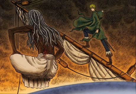
Proj2501 said:Hey all! This lil piece is 3/4 done. Lately I've been trying new techniques and currently theres maybe 4 pieces im workin on at a time. Therein lies my problem. Well here's a lil tid bit of things to come and hopefully they get better!
http://i4.photobucket.com/albums/y112/Proj2501/Skully.jpg
Outstanding!
Vaxillus
The one and only severed head
Awesome, I love the water, but CnC's right (as always) it needs more reflection. Looke at some scource pics for a ref.
http://www.moviepostershop.com/item_img/spa8.jpg
http://www.moviepostershop.com/item_img/spa8.jpg

 well it came out very nice!