You are using an out of date browser. It may not display this or other websites correctly.
You should upgrade or use an alternative browser.
You should upgrade or use an alternative browser.
Proj's colors
- Thread starter Lithrael
- Start date

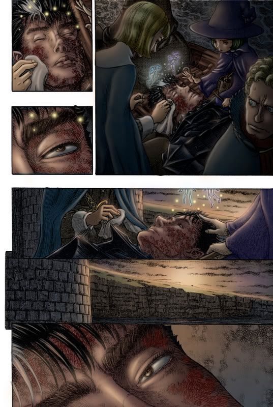
Since we are finally embarking on a sea voyage,
Enjoy.
Full Res link: http://vs02.justedge.net/~afn20039/ig/displayimage.php?album=lastup&cat=10005&pos=0
EDIT* New version. Thanx for the feedback.
Enjoy.
Full Res link: http://vs02.justedge.net/~afn20039/ig/displayimage.php?album=lastup&cat=10005&pos=0
EDIT* New version. Thanx for the feedback.

Wonderful Proj.
The new Proj's more colorful than the old one.It fits the fantastic subjects and i like your way of using the colors although it's not very realistic but more fantastic.
Thank you for your working.
The new Proj's more colorful than the old one.It fits the fantastic subjects and i like your way of using the colors although it's not very realistic but more fantastic.
Thank you for your working.
blueberserk said:although it's not very realistic but more fantastic.
Blue, could you elaborate? I'd just like to hear a little more specific critique is all. ;)
Hey Proj, another good one.
I'm not totally sure what blueberserk's getting at but for me, I think the only glaring problem is the uniformity in texture. The pitfall of that soft airbrushed look is that everything can have that metallic sheen. Everything from the clothes, skin, rock, wood seems to have the same level texture. And with that many highlights it can be hard to pick out a focal point. I think Guts skin, in particular could stand to lose a bit of that gloss (while Shierke's could use some warming up, as she looks a bit pale). Also note that the wall of the city seems too flat (where's the hightlight/shadows on rock)?
Keep in mind the lighting is that of a sunrise, so I think that may be why you're thinking its fantastical.
Just as a side note, keep in mind you're telling a story on this page. There's no dialogue so colors can help. Imagine if its pre-dawn in the first panel with most of the elves generating the light and the next two panels are the sun beginning to hit Guts' face. The rest of the page would say as is. That would set up the spread with Griffith coming up on the next page. Not a requirement but just a suggestion.
I'm not totally sure what blueberserk's getting at but for me, I think the only glaring problem is the uniformity in texture. The pitfall of that soft airbrushed look is that everything can have that metallic sheen. Everything from the clothes, skin, rock, wood seems to have the same level texture. And with that many highlights it can be hard to pick out a focal point. I think Guts skin, in particular could stand to lose a bit of that gloss (while Shierke's could use some warming up, as she looks a bit pale). Also note that the wall of the city seems too flat (where's the hightlight/shadows on rock)?
blueberserk said:It fits the fantastic subjects and i like your way of using the colors although it's not very realistic but more fantastic.
Keep in mind the lighting is that of a sunrise, so I think that may be why you're thinking its fantastical.
Just as a side note, keep in mind you're telling a story on this page. There's no dialogue so colors can help. Imagine if its pre-dawn in the first panel with most of the elves generating the light and the next two panels are the sun beginning to hit Guts' face. The rest of the page would say as is. That would set up the spread with Griffith coming up on the next page. Not a requirement but just a suggestion.
Wow your coloring is really good, I saw some of your drawings too, great stuff man.
CnC said:I think the only glaring problem is the uniformity in texture.
I can see what you mean. Maybe different style brushes?
CnC said:(while Schierke's could use some warming up, as she looks a bit pale). Also note that the wall of the city seems too flat (where's the hightlight/shadows on rock)?
magine if its pre-dawn in the first panel with most of the elves generating the light and the next two panels are the sun beginning to hit Guts' face. The rest of the page would say as is. That would set up the spread with Griffith coming up on the next page. Not a requirement but just a suggestion.
Re-worked a few things based on your suggestion. Particularly the lights from the elves. (See Farnese's face.) Darkened up the fisrt panel, highlights on the brick and gave a little more red to Schierke's face. Spanx man.
Proj2501 said:I can see what you mean. Maybe different style brushes?
Varying up the brushes can help. Just a change in brush hardness and a different stroke can give the illusion of texture. So just see what works.
Proj2501 said:Re-worked a few things based on your suggestion. Particularly the lights from the elves. (See Farnese's face.) Darkened up the fisrt panel, highlights on the brick and gave a little more red to Schierke's face. Spanx man.
I made another GIF to demonstrate a bit of what I'm talking about. Basically I just pushed what you did a little further. Added a distinctive shadow on Guts' face to give the light direction, made the light emanating from the elves a bit more distinctive in the first panel, etc. Just some changes to the overall lighting. I hope that demonstrates a bit more of what I'm talking about...
CnC said:I made another GIF
Ah, I see what you mean now. I'm a visual learner. ;)
Why can't I just have a CnC Feature in Photoshop. Come to think of it, get on that why don't ya?
My bad about GOW the other night. I passed out.
Proj2501 said:Why can't I just have a CnC Feature in Photoshop. Come to think of it, get on that why don't ya?
I'm sure it wouldn't be too hard to make a button that will generate a pop-up window that says "Check your LIGHTING!"
tsk tskProj2501 said:My bad about GOW the other night. I passed out.

Proj2501 said:http://i59.photobucket.com/albums/g293/RRomero704/IsidromeetsPuck.jpg
Working on finishing OLD projects.
Ah man I really like this one! :)