You are using an out of date browser. It may not display this or other websites correctly.
You should upgrade or use an alternative browser.
You should upgrade or use an alternative browser.
CnColors
- Thread starter CnC
- Start date
blueberserk said:Ok,i got it.The physique is 17's and the pectoral is 32's.
That's a super perfect combination, i like this style.
what? no. Its all 17. Look at the cave scene.
Thanks Kart
CnC said:what? no. Its all 17. Look at the cave scene.
Thanks Kart

Yon mean this?
Don't you think it's more drall and more smooth?
blueberserk said:Yon mean this?
Don't you think it's more drall and more smooth?
I think I finally see what you mean (although drall isn't a word). You want the pectorals to be more smooth, I get it.

Bingo!!CnC said:I think I finally see what you mean (although drall isn't a word). You want the pectorals to be more smooth, I get it.
My logic is drall=smooth(drall pectoals makes it smooth
 )
)blueberserk said:drall
Dude, "drall" doesn't mean anything. Read what CnC told you, it's not a word.
Oh my bad, i finally find "drall" is a German word...Aazealh said:Dude, "drall" doesn't mean anything. Read what CnC told you, it's not a word.

I made it mixed with "beefy".....

handsome rakshas
Thanks Grail!
I love it! Pretty damn good for a practice page, you are the master! Roderick looks very handsome! 
Griffith
With the streak of a tear, Like morning dew
Really cool how you brought out the "time of day" with the lighting of the characters. I initially just assumed these episodes as being in broad daylight, though the darkness of the sky certainly leaves the time/weather open to interpretation. Nice job interpreting and fleshing that out.
And on a general note, this just reminded me of something I took note of (though probably fairly obvious to everyone already) during a little editing project I never posted a while back; how beautiful the artwork is on any given page when you just get rid of the text. I think it literally changes how your mind perceives the image because we're so conditioned on the way to examine pages or documents with any sort of words on them, as opposed to pictures, it can't help but be a distraction on at least a subconscious level.
Just another reason not to add extraneous white boxes. (can I get an emot just for when I bash DH, like :deadhorse:?)
And on a general note, this just reminded me of something I took note of (though probably fairly obvious to everyone already) during a little editing project I never posted a while back; how beautiful the artwork is on any given page when you just get rid of the text. I think it literally changes how your mind perceives the image because we're so conditioned on the way to examine pages or documents with any sort of words on them, as opposed to pictures, it can't help but be a distraction on at least a subconscious level.
Just another reason not to add extraneous white boxes.
(can I get an emot just for when I bash DH, like :deadhorse:?)"Griffith No More!" said:Just another reason not to add extraneous white boxes.


 ) really made me appreciate it more.
 vlad said:maybe the dude behind Roderick and the captain is a bit too yellow
what? Whats that? speak up!

I washed some of the people behind Roddy with some sunlight to push them back.
lol I got the point, just dunno, to me he seems more seasick than sunbathedCnC said:what? Whats that? speak up!
I washed some of the people behind Roddy with some sunlight to push them back.

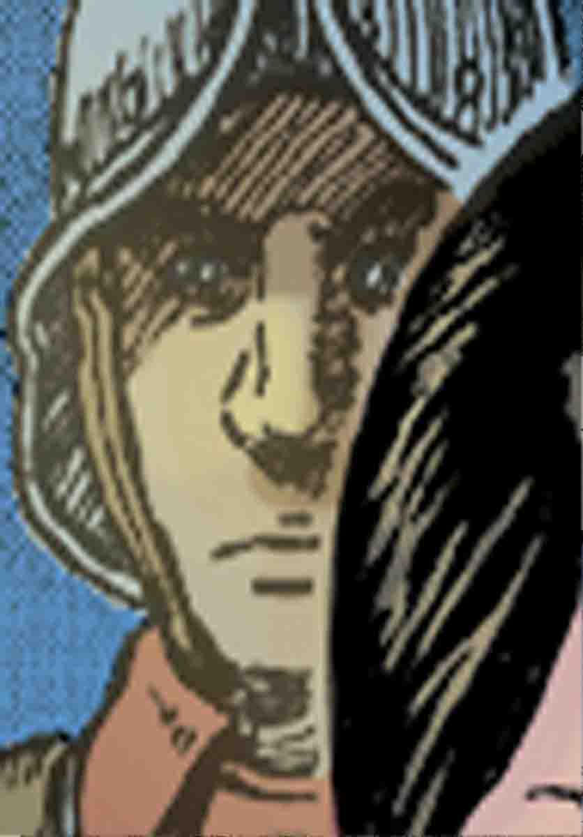
maybe make the area that's shaded my his helmet a normal tone, so that it looks less like he's a manga-style simpsons character?CnC said:grrr... well aside from your sudden prejudice against yellow people, thanks guys.
Griffith
With the streak of a tear, Like morning dew
CnC said:Whats up everyone. Bit of a practice page. Working with depth and saturation (and narrative flow). Also no airbrushing allowed this time around :)
Thanks for viewing:
Call to Battle Stations
Wow I had no idea it was so prominent, Griff.
Sorry fellas but bathing the person behind Roderick in yellow light was intentional. If I brought the helmet back to its original color (which really is just a reflective blue), the guy really would look sick. Its not too hard to find examples of light changing skin tone (Just look at this group of martians in this picture I found)
Stay tuned for more Cn-beams everywhere-Colors