Brand of Sacrifice

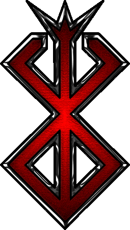
Hi all, just thought I'd share a bit with you all. This is something that I made in Flash and Photoshop months ago, and was slated to be my PS3 avatar pic for online gaming and whatnot. And as most who have PS3s know, online PS3 avatars must be chosen from a list, they cannot be uploaded. So it never went anywhere. But I just found it laying around and thought...there really isn't any high-quality image of the brand of sacrifice floating around the web, at least non I've seen. So I thought I could just post it, both to see what ppl think of it and to give people something they can use for whatever reason. So tell me what ya think =)
BrandOfSacrifice.png
 

Aazealh

Administrator
Staff member
Hi there. Well, it's nicely done but the crown is a bit big compared to the rest. It's a shame you couldn't use it as an avatar like you originally intended to.
 
Yea, lessen the size of the crown. It looks like it'd make a nice decal for a car. Maybe without the red...
But yea, go you for crafting some Berserk goodness!
 
Baato said:
Hi all, just thought I'd share a bit with you all. This is something that I made in Flash and Photoshop months ago, and was slated to be my PS3 avatar pic for online gaming and whatnot. And as most who have PS3s know, online PS3 avatars must be chosen from a list, they cannot be uploaded. So it never went anywhere. But I just found it laying around and thought...there really isn't any high-quality image of the brand of sacrifice floating around the web, at least non I've seen. So I thought I could just post it, both to see what ppl think of it and to give people something they can use for whatever reason. So tell me what ya think =)

http://i22.photobucket.com/albums/b309/Kazame/BrandOfSacrifice.png

That's pretty cool. I do agree that the crown is too large. The texture on the brand is pretty good, I also like how you used a kinda of chrome effect... maybe that's not the best choice of words but I do like how the edges are sharp. They remind me of blades. It also gives the Brand a "modern" look, like something you would see at a metal concert.

I don't know if it was intentional, but I like how the center of the brand is lighter then the rest.
 
As soon as I saw your brand the transformers logos immediately came to my mind for some reason.

Anyway, it is very nice, though I agree that the crown is a bit too big.
 

Scorpio

Courtesy of Grail's doodling.
I think the crown is ok. I personally prefer the original sizing, but the large crown seems like it was intended and gives it its own sort of flair (good since you wanted it to be a gaming avatar). Overall I think you did a good job. Now go make something else!
 
Top Bottom