Comet Colors

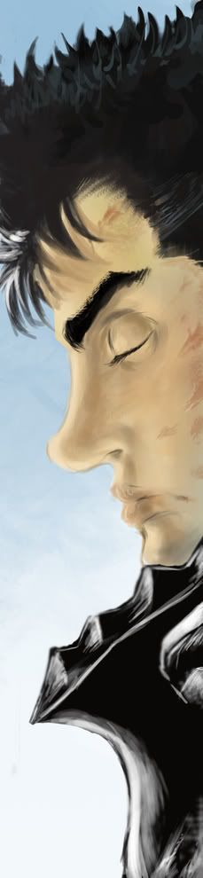
Sup, I'm new to the whole coloring thingy. I mean I have used like markers and crayons to color pictures of kitten and such... but then my friend got me photoshop and I got to using it and came across all these coloring jobs, so I thought I might take a stab at it. So yeah, this is my first attempt try not to laugh.

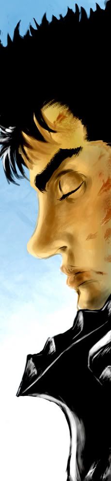
I've worked more on the right than the left so the left-side is pretty iffy, IMO. I dunno left could rock while right sucks ass, I don't know. but anyhoo...

http://img217.imageshack.us/my.php?image=berserkv29c249p058copycopy8hw.jpg
 
When I was first working on it I couldn't understand why everything looked all.... happy. Then I saw hue and saturation in the adjustments part of the edit menu, thing. So If i didn't come across that It probably would have looked much worse.
 

CnC

Ad Oculos
Hey comet, welcome to the boards!

A very well done piece to start off here. Good work.
I'm glad you made use of the hue-sat adjustment, its a very powerful tool. Most of the adjustments are.

At the risk of sounding like a broken record on these forums ('cause I sure do say it a lot): I would spend more time shading the scene and paying attention to lighting. Notice the shading on his face in the second panel is done where surface is at a certain angle?
Given the scene he's in I would take that to mean a light source is hitting him from just behind him and more than likely reflected light is hitting him from behind. That would make the darkest areas where miura indicated.

Lighting these things is sometimes a puzzle which can make it fun :)

That aside, again, great start. Keep on postin'.
 
:guts:
Thanks for the positive feedback. I'm attempting to do the whole shading thing, I've only done the face at this point so tell me whatcha think.


http://img291.imageshack.us/my.php?image=berserkv29c249p058copy1jj.jpg

The wooden door/wall thing behind him looks way too bright, that's next up to bat.

I've said "thing" like 50 times so far.
 

CnC

Ad Oculos
Hey comet,

I'm digging the updates. My only real crit would be to mind the flesh tones. While making him on the yellowish side is ok, theres more to skin than the base color and a darker version of that base color. All surfaces respond to light differently.
I just did a quick paintover to explaing what I mean, also including what I said earlier about rim-lighting.

guts_comet.gif

first frame is your drawing as of this morning, and second is the overpaint.
 
CnC said:
Hey comet,

I'm digging the updates. My only real crit would be to mind the flesh tones. While making him on the yellowish side is ok, theres more to skin than the base color and a darker version of that base color. All surfaces respond to light differently.
I just did a quick paintover to explaing what I mean, also including what I said earlier about rim-lighting.

guts_comet.gif

first frame is your drawing as of this morning, and second is the overpaint.

Wow, I must say that looks amazing. I just found your turt about lighting and I've been reading it. I'm going to see what I can do.
 
Okay, so I've been trying alot of different things to get that effect.

this one come out best imo
http://img126.imageshack.us/my.php?image=berserkv29c249p058copy123450ic.jpg

What I did was
Made a new layer
Picked like a brownish color
Colored in where I think it would be darker
Added motion blur in the direction on the light
Added a Gaussian blur to a point where I thought it looked good
Erase all that went out of the lines.

I dunno, I think it looks okay.
 

Lithrael

Remember, always hold your apple tight
Yeah, I like it so far! Like Spikey said, I like the subdued colors. It reminds me of Blade of the Immortal colored like that...
 
Nice first colorings RedComet, keep practising and after a while you'll get the basics of coloring
(shadows, lightfall, reflected light, but also skintones.. etc)..

I, myself often have troubles too finding a decent color palette. The more you make, the more it's gonna make more sense along the way (if that makes sense hehe).

Here's a real quick sketch in Photoshop of the same panel I just made to give you some perspective of my point of view:

guts.jpg


I'm not saying that the colors are all that good and whatever. If you look close enough you would notice that I put some blue skintones on his face (also too give some other colors more warmth) and for example some yellow tints under the hairs on the upper half of guts head, because of the thickness of the skin on that area.

For more information on skintones check out this great artist :www.furiae.com
If your really interested in making more art, or you think it's just fun-->check the site out, it really helps.

Anyway, I pushed up the contrast for an other sort of effect (in photoshop: image-->adjustments-->brightness/contrast)...I recommend you play alot with this function (togheter with 'adjustments-->hue/saturation..it's good practise like CnC allready said.
(I must say in the first version I didn't use any of this just as good practise, but I do recommend you use it for at least the nearby future)

guts_contrast.jpg


another TIP> convert your image to grayscale to see your balance of the contrast in the image..
an easy way to do this> image--> convert to grayscale

this is what happens:
gutszw.jpg


as you probably notice, I could've taken this a lot farther into the direction of 'contrast'..


This was just an example to explain some things, togheter with an example.

CnC is here to correct me if I'm wrong :void:
 
Rickert said:
Here's a real quick sketch in Photoshop of the same panel I just made to give you some perspective of my point of view

The color on the lips in that one look a bit... off, might just be me, but I can see what you're saying.

Thanks for the pointers.

EDIT:

http://img49.imageshack.us/my.php?image=berserkv29c249p058copy123455ba.jpg

I tried putting the shading on the face to the right and some other small tweaks.

I'm going to try making a better flesh tone palette like you said next.
 

CnC

Ad Oculos
I think if you just add some subtle cool colors to the flesh tones it might just do it for skin tone.

Overall its looking nice.

Rickert's example of contrast is good, but I would go as far to say perhaps there's TOO much contrast on that second pic. The first pic looks better with just a subtle hint of more contrast.


Oh, and watch your edges, theres some bleeding goin' on around Guts' nose and lips.
 
CnC said:
I think if you just add some subtle cool colors to the flesh tones it might just do it for skin tone.

Overall its looking nice.

Rickert's example of contrast is good, but I would go as far to say perhaps there's TOO much contrast on that second pic. The first pic looks better with just a subtle hint of more contrast.


Oh, and watch your edges, theres some bleeding goin' on around Gut's nose and lips.

TheRedComet: you're always welcome, and btw yes the lips might be a bit off. It's a hasty piece and I'm not very good at lips, that's why...

CnC: I kind of expected you to say something like that. But I intentionally leaved the first piece without any bit of contrast and exaggerated the contrast on the second piece. An exaggerated example, one might say. Maybe I tune it all a bit up anyway (the first piece), but actually I'm finished with this stuff and move on to my other sort of art.
Thanks for your reply.
 
Top Bottom