You are using an out of date browser. It may not display this or other websites correctly.
You should upgrade or use an alternative browser.
You should upgrade or use an alternative browser.
Dodole's doodles of Lame Title
- Thread starter D0dole
- Start date
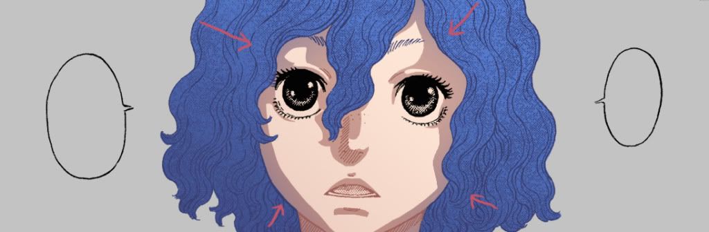
D0dole said:I wasn't sure how to color her eyes, since she apparently has no pupils.
She does, but they're drawn differently from those of other characters. There's no clear confirmation of what her eye color is anyway.
Gobolatula
praise be to grail!
Fantastic job, man. That Guts/Farnese one blew my mind. Plus, Schierke is looking super badass.
Aw thanks a lot for the kind words guys!! 
Hmm... dunno if I LEARNED it. It's mostly about trying many different things over the time (and failing), learning what your tools can do, observing what's been done by others and how, I think. And that's a never ending process.
Well, for this kind of coloring... First I separate the lines from the page to have them on a layer with transparency. Then I fill in the main colors I want with a layer under that line layer. Then I lock the pixels on the line layer and color different parts of the lines the way I see fit. And then, with a army of layers, selections with the lasso, gradients to soften certain edges up and many layer copies of different attemps, I have a layer right above each of the filled color sections that acts as shadows. I usually modify that layer's colors in different places.
And I think that's it. I usually also have a layer on top of the line layer to add the glowy eye reflections and stuff like that. And another layer to change the color of the cheeks and lips a bit (layer mode may vary). Sometimes I'm gonna use a color balance layer and/or a brightness/contrast above everything else or just certain layers if I want to change the atmosphere a bit, or if I have more than one pannel and want to make them fit together more. Oh right, and I add a background in the back.
Just mentionning, the main problem I had working this way: when there's a lot or crosshatching, screentones and such it's harder to get a cleaner result. Taking the Schierke pic for example, the tips of her hair end on the inside of her hat. Keeping the lines of her hair green while trying to get a gradient in the hat lines was a total mess. But I dont know a better way to do it
Hope that wasn't too confusing.
SrCraneo said:That's just awesome, how did you learn to color like that? D:
Hmm... dunno if I LEARNED it. It's mostly about trying many different things over the time (and failing), learning what your tools can do, observing what's been done by others and how, I think. And that's a never ending process.
CCS said:What kind of layering do you use in Photoshop?
Well, for this kind of coloring... First I separate the lines from the page to have them on a layer with transparency. Then I fill in the main colors I want with a layer under that line layer. Then I lock the pixels on the line layer and color different parts of the lines the way I see fit. And then, with a army of layers, selections with the lasso, gradients to soften certain edges up and many layer copies of different attemps, I have a layer right above each of the filled color sections that acts as shadows. I usually modify that layer's colors in different places.
And I think that's it. I usually also have a layer on top of the line layer to add the glowy eye reflections and stuff like that. And another layer to change the color of the cheeks and lips a bit (layer mode may vary). Sometimes I'm gonna use a color balance layer and/or a brightness/contrast above everything else or just certain layers if I want to change the atmosphere a bit, or if I have more than one pannel and want to make them fit together more. Oh right, and I add a background in the back.
Just mentionning, the main problem I had working this way: when there's a lot or crosshatching, screentones and such it's harder to get a cleaner result. Taking the Schierke pic for example, the tips of her hair end on the inside of her hat. Keeping the lines of her hair green while trying to get a gradient in the hat lines was a total mess. But I dont know a better way to do it
Hope that wasn't too confusing.
Lithrael
Remember, always hold your apple tight
These are super pretty.
I've never understood how people get anything useful out of photoshop gradients though! I can't even begin to figure out how you get that kind of effect. Is it that you grade to transparent and your lassoed selections have feathered edges, or what? I always have to paint everything and that just isn't ever going to look so slick and professional. I'd be eternally grateful for some demonstrative advice, or if you can point me to a tutorial that uses a similar technique or something.
I've never understood how people get anything useful out of photoshop gradients though! I can't even begin to figure out how you get that kind of effect. Is it that you grade to transparent and your lassoed selections have feathered edges, or what? I always have to paint everything and that just isn't ever going to look so slick and professional. I'd be eternally grateful for some demonstrative advice, or if you can point me to a tutorial that uses a similar technique or something.
Lithrael said:These are super pretty.
I've never understood how people get anything useful out of photoshop gradients though! I can't even begin to figure out how you get that kind of effect. Is it that you grade to transparent and your lassoed selections have feathered edges, or what? I always have to paint everything and that just isn't ever going to look so slick and professional. I'd be eternally grateful for some demonstrative advice, or if you can point me to a tutorial that uses a similar technique or something.
Thank you :) It's nothing fancy really, I'm more of a painting person myself so I'm pretty much still in the midst of discovering the wonders of the lasso and gradient tools.
The process pretty much varies depending on the picture, I'm just trying to figure out what's more convenient everytime. Usually I use the lasso when I want to conserve hard edges while softening one. And gradients.... I just slap them on things to make them prettier, really. But since I kinda suck at explaining things I made a little example.
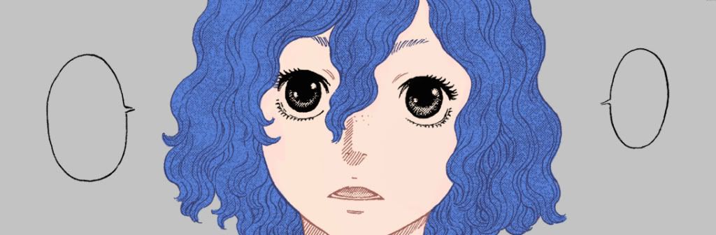
So here I took a really simple panel, filled the base colors under the line layer in and painted the lines the color I wanted.
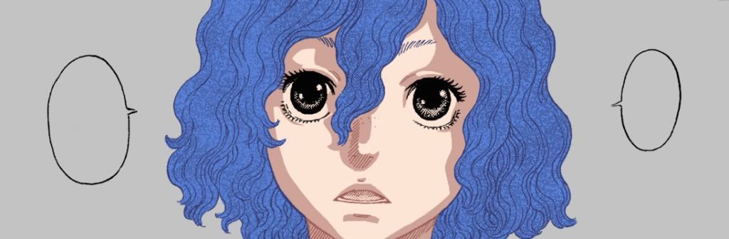
And here I painted hard shadows on a separate later. If you find it handy, lasso tool works. I think it looks cleaner. But I have a wacom here so I usually just paint them and zoom in to clean the whole thing up a bit. It's also better so have more shadows than you need, because later I'll go in with a really soft eraser to make the soft edges.
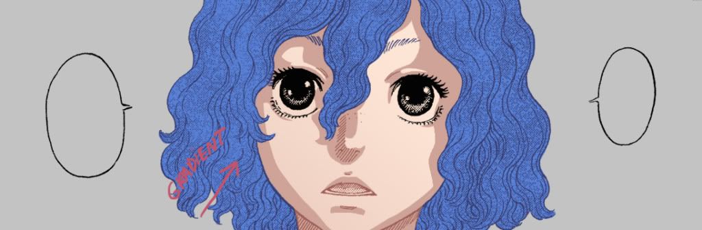
But before that, gradients on everything. Is it necessary? Nope, but I personnally like the effect. So one gradient on the main skin color, arrow indicates the direction, I usually pick a color slighty darker than the main color, but may also use colder or warmer tones depending on the desired atmosphere, or a specific color contrast you'd be aiming for.
Another gradient on the shadows. I usually lock the pixels to do the gradient btw. (If anyone is wondering it's in the layer box, under the layer type, you can chose to lock various things, First one locks pixels, and make you unable to paint over transparency.)

One for the hair... But I won`t bother to give it shadows this time.
Another thing I like to do is give shadows hues of the surrounding objects. So with either a normal or round gradient, depending on the shapes, I go with the darker blue I used for the hair and gradientize (making up new words here
 ) lightly the shadows surrounding her face.
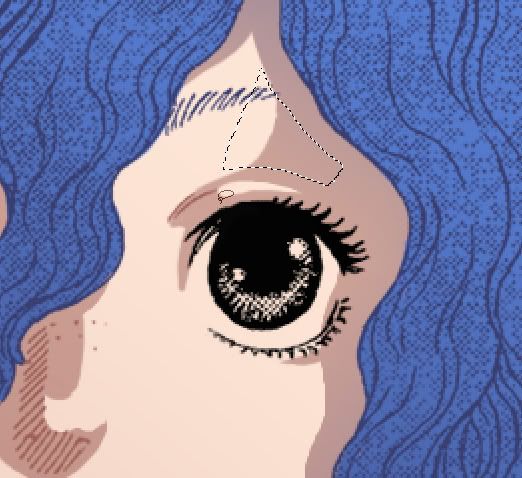
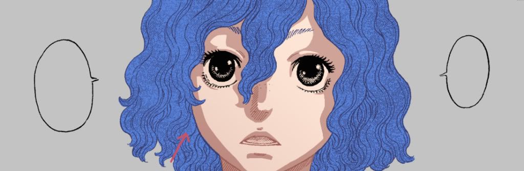
So here's what I meant by conserving hard edges. Say, I decide some of this shadow area should be hard because it's the direct, close shadow the hair projects on her face. But I also think there should be a soft edge here because of the roundess shape of her browbone. Lasso tool help with that. So I basically make the selections I need, one by one, and use a really fluffy, soft brush, maybe with low opacity if needed, and erase gently till I get the result I want.
Here's what it looks like so far, I also added more gradients to her main skin tone. I mean, if anything feels right just do it.
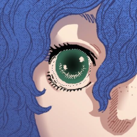
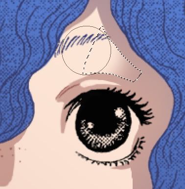
Another use for the gradient; since most of the iris is already drawn in ink, you're gonna have to go on that line layer and paint the color you might want there. Just isolate the section with a selection, and use the round gradient to get the color you want. The outer rim could be darker, of the opposite, or should can use various shades of the same color, there isn't really a "right" way to do it. Sometimes I just paint it with a brush. A world of possibilities
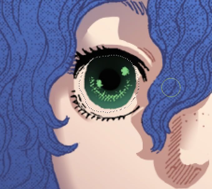
I darkened the upper part of the iris with some black gradients to make it less creepy, painted the black pupil in with a hard brush and painted a lighter color on a layer underneath.

And on a layer on top of everything... the famous shiny dots. I just placed them where Miura did. On a layer below the iris layer, I filled the eye with white. Not gonna stay white for long, pure white is a fiend.

And finally I just locked the white layer, and with a swarm of normal gradients, I colored the rim of the section (pixels lock, of course) with a reddish gray and a darker gray on top, in less quantity. I also painted the lines round the eye to lighten them up and to make them blend in more.
Also (on a side note), on the Farnese & Guts pic, I made highlight the same way I made the shadows. Bigger variety of tones.
CCS said:I second Lithrael's question.
Also when you add the highlights on the top layer do you use a hard round brush or a more airbrushy, gradual one? What opacity do you set that to?
Thanks for the info!
Hard brush for highlights. But that really depends on the material you're goind for. Normally, the sheen on skin is a loooot more diffused/spread/softer than the glossy look of hard-edged highlights. I just picked the hard brush this time to fit the style. But sometimes I go back and erase them a bit with a softer, low-opacity brush (if I find it TOO glossy-ish)
---
Oooof okay, so basically this is all without the fancy shmancy layers in various blending modes, the effects, the color corrections and by far with less time than the other colorisations. But really, in overall, I think it's mostly about trying stuff out and having fun with it. Like I said, it's never exactly the same process with every picture depending on what you're aiming for, and what the picture is. Just use whatever is more convenient for the desiered effect.
I hope it helped anyone, sorry if I'm not too clear, if I made lots of mistakes and for the load of pics. If anyone has more questions I'll be glad to answer!
Thanks guys
Proj2501 said:Very interesting technique. Your pieces are really gorgeous and you should be proud.
Aww thanks! :)
Also, I just tried to go back and fix some of my mistakes. Gosh I can't type :x
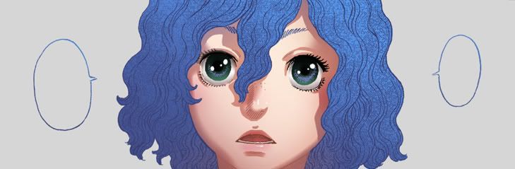
Edit: If anyone cares, here's a slightly more polished version for fun.
Gobolatula
praise be to grail!
What is the simplest way to "paint the lines?" I've found this part difficult when attempting photoshop coloring of my own work.
Gobolatula said:What is the simplest way to "paint the lines?" I've found this part difficult when attempting photoshop coloring of my own work.
It took me a long time to figure it out but once you know it it's really simple. Go to your channel tab in the layer box, hold Ctrl + left click the small image of the RGB channel. What Ctrl+Left clicking the little image does on a layer is that it selects all the pixels, while taking transparency into account. What it does on channels I believe is select it's value (from 0 to 255 for all channels). basically, when all three channels are at 255 in the color window, it's white, and when they're all at 0, its black. Therefore, in a black and white image, Ctrl+left click will select all the white, aka the opposite of what you want. So all you do from then is revert your selection, create a new layer, take that paint bucket tool and make your selection black. So there you should have the entire linework with transparency. Then I usually just lock the pixels, pick a color and paint over that. If it's not too clear I could post screencaps tomorrow night. :)
Hope it helps!
Lithrael
Remember, always hold your apple tight
Awesome! Thanks for the excellent demonstration. 
I took the panel I'm working on and tried this method out!
So here's the one I already had in my usual style and one in this style.
Both are still way WIP's though.

I'm still not really sure what I'm doing but I think I'm on the right track.
One thing I found useful right away is that I'm using an opacity mask on the shadow layer to 'erase' shadow areas, rather than actually erasing them, because if I decide later that I erased too much it's MUCH easier to fix (otherwise I end up redrawing some shadow area then pixel locking it and redoing the gradient fill for that area).
It seems like my main drawback here is that I'm just not using soft brushes skillfully, and I still end up with a mottled, painted look when I use the brush to mask out a shaded area. Luckily with this method I can fix that by blurring the crap out of it, but I still need to figure out how to handle soft brushes properly.
In summary: thank you Dodole!!
I took the panel I'm working on and tried this method out!
So here's the one I already had in my usual style and one in this style.
Both are still way WIP's though.
I'm still not really sure what I'm doing but I think I'm on the right track.
One thing I found useful right away is that I'm using an opacity mask on the shadow layer to 'erase' shadow areas, rather than actually erasing them, because if I decide later that I erased too much it's MUCH easier to fix (otherwise I end up redrawing some shadow area then pixel locking it and redoing the gradient fill for that area).
It seems like my main drawback here is that I'm just not using soft brushes skillfully, and I still end up with a mottled, painted look when I use the brush to mask out a shaded area. Luckily with this method I can fix that by blurring the crap out of it, but I still need to figure out how to handle soft brushes properly.
In summary: thank you Dodole!!
Grail
Feel the funk blast
Thanks for taking the time to give us those examples, D0dole! Varying hard and soft shading is a time-consuming process (at least I think it is  ), but your artwork proves that it's well worth it!
Edit: I just tried locking transparent pixels, and it's amazing! Has this been around a while, or just implemented in the newer versions of Photoshop? Either way, I'm planning on thoroughly abusing this.
), but your artwork proves that it's well worth it!Edit: I just tried locking transparent pixels, and it's amazing! Has this been around a while, or just implemented in the newer versions of Photoshop? Either way, I'm planning on thoroughly abusing this.
Drakull said:wonderful coloring ! Thanks for tips !
Thanks! You're super welcome
Lithrael said:Awesome! Thanks for the excellent demonstration.
I took the panel I'm working on and tried this method out!
So here's the one I already had in my usual style and one in this style.
Both are still way WIP's though.
I'm still not really sure what I'm doing but I think I'm on the right track.
One thing I found useful right away is that I'm using an opacity mask on the shadow layer to 'erase' shadow areas, rather than actually erasing them, because if I decide later that I erased too much it's MUCH easier to fix (otherwise I end up redrawing some shadow area then pixel locking it and redoing the gradient fill for that area).
It seems like my main drawback here is that I'm just not using soft brushes skillfully, and I still end up with a mottled, painted look when I use the brush to mask out a shaded area. Luckily with this method I can fix that by blurring the crap out of it, but I still need to figure out how to handle soft brushes properly.
In summary: thank you Dodole!!
Ohh I love that panel! Well whatever method you use, they both look pretty cool so far. And that opacity mask sounds brilliant, how do you create it? I usually make a copy of the shadow layer before I start erasing in case I screw up but you method sounds waaay better.
I don't like soft brushes much either, usually if I'm just painting things in photoshop I use the hard round brush with only opacity on pen pressure (it's like my baby
 ) I find soft brushes hard to use because there's no way to get hard edges with those. So I just use them in special cases.
Also, you're very welcome! :)
Grail said:Thanks for taking the time to give us those examples, D0dole! Varying hard and soft shading is a time-consuming process (at least I think it is
Edit: I just tried locking transparent pixels, and it's amazing! Has this been around a while, or just implemented in the newer versions of Photoshop? Either way, I'm planning on thoroughly abusing this.
Aw thanks! You're welcome. I think the time taken to vary edges is worth is, since I found out while doing these that I color a LOT faster this way. When I paint I just overlap brush stroke after brush stroke and overwork small details. But with this method its easier to work everything at the same time and at the same pace.
About locking pixels... I'm pretty sure I was using it when I had Photoshop 7, so guess it's been there for a while now. Finding it out was just as amazing to me as discovering what layers were, haha. I can't work without it now :)
Lithrael
Remember, always hold your apple tight
Thank you! I'm fond of them both but I definitely like how the smile looks a lot better with your method. Lines just accentuate a smile better than a soft swell does, I think.D0dole said:Ohh I love that panel! Well whatever method you use, they both look pretty cool so far.
[quote author=D0dole]And that opacity mask sounds brilliant, how do you create it? I usually make a copy of the shadow layer before I start erasing in case I screw up but you method sounds waaay better.[/quote]
Layer masks rock, though like clipping masks I only recently realised they're useful! Just click the (usually) second button on the bottom of the layers rollout and it creates a mask for the currently active layer. Then you can click on the mask and start painting it black to get your erase effect, and paint white again to un-erase. Just watch out whether the layer mask or the actual layer art is active, cause of course if you click on the art half and start painting black, you're painting on the art, and if you're trying to adjust the art and you're on the mask half you'll only be affecting the opacity! Scroll about halfway down this page: http://www.lunacore.com/photoshop/tutorials/tut003.htm and there's a nice no-nonsense description of the basic options.
[quote author=D0dole]I think the time taken to vary edges is worth is, since I found out while doing these that I color a LOT faster this way. When I paint I just overlap brush stroke after brush stroke and overwork small details. But with this method its easier to work everything at the same time and at the same pace.[/quote]
Definitely yes. I can see where the workflow would be billionty times better with this technique once you get the hang of it.