Vaxillus
The one and only severed head
This one could use a lot more contrast. The fire from the cannon blast should light up the beetle familiar's face a lot more. The color is also bleeding a bit in a few areas. Also, don't be afraid to make the skin a bit darker when it's not being hit by the light. I doesn't have to be bright pink all the time. Getting better though, you're starting to get better with light sources.spikeyhairedcadet said:http://www.lithrael.com/ig/albums/userpics/10009/Blackswordsman%20copy.jpg
Something I've been dabbling with for some time...
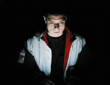
 I didn't realize that the orange for the light source was so subtle. Heres an update...