Great work Vax! I really like the Guts & Zodd coloring I like the colors used on Serpico's formal wear as well!!
You are using an out of date browser. It may not display this or other websites correctly.
You should upgrade or use an alternative browser.
You should upgrade or use an alternative browser.
Vax's Colors
- Thread starter Vaxillus
- Start date
Vaxillus
The one and only severed head
Ok, I'll deal with the background. I'm guessing you mean as a transparent Gif?
@spikeyhairedcadet: Thanks, though I'm pretty low on the talent list on this forum. Having a master colorizer (Lithreal) and a photorealistic painter (CnC) is some stiff competition though. Sorry to all you folks for not doing more, I'm busy with an anime club comic submission right now and before that, I was just lazy .
.
@spikeyhairedcadet: Thanks, though I'm pretty low on the talent list on this forum. Having a master colorizer (Lithreal) and a photorealistic painter (CnC) is some stiff competition though. Sorry to all you folks for not doing more, I'm busy with an anime club comic submission right now and before that, I was just lazy
.Vaxillus said:@spikeyhairedcadet: Thanks, though I'm pretty low on the talent list on this forum. Having a master colorizer (Lithreal) and a photorealistic painter (CnC) is some stiff competition though. Sorry to all you folks for not doing more, I'm busy with an anime club comic submission right now and before that, I was just lazy
While there is definitely talent on this board (not speaking of myself, but others, mind you -head's big enough as it is), it should never be a deterrent to contributing your own work. I think if people post here and receive feedback (even when its more constructive criticism than praise), they improve upon every subsequent submission. Many people here have made vast improvements over when they started posting. Nix that, ALL people who have posted here have improved since they started, yourself included.
Gotta keep at it and keep learning.
Like they say, practice makes perfect. I'm hoping more people will post their colors/drawing/etc in the future so that we all can benefit from them.
That said...

Get to work!!!
Rhombaad
Video Game Time Traveler
CnC said:
Get to work!!!
I feel terrified and yet submissive at the same time. Must...get...to...work...

Rhombaad said:I feel terrified and yet submissive at the same time. Must...get...to...work...
The fact that you haven't submitted anything since that post is downright offensive.

Ok, I'll forgive you this time. maybe.
Vaxillus
The one and only severed head
For Walter, transparent and shrunkified:
Edit: Couldn't get rid of those white lines, I think they're compression artifacts. Shouldn't show up on the white Encyclopedia bg though.
Edit 2: I'm getting to work CnC, don't worry. After seeing the angry version of yer avatar, I don't think I'll be slacking off for quite a while...
Edit: Couldn't get rid of those white lines, I think they're compression artifacts. Shouldn't show up on the white Encyclopedia bg though.
Edit 2: I'm getting to work CnC, don't worry. After seeing the angry version of yer avatar, I don't think I'll be slacking off for quite a while...
Vaxillus said:Didn't show up that those extra lines were there. I'll try again though.
You can see them with the naked eye even in Photoshop. And if you try to select the blank areas with the Magic Wand you'll notice that they're there. If you've got a recent version of Photoshop you can go to Edit>Preferences>Transparency and just change the grid colors. Make them black on orange or something and you'll see these lines very clearly.
If I were you I'd just select and delete them manually, shouldn't take long.
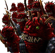
I like Vax! Keep it up!  Keep working with that lighting!
Keep working with that lighting!Vaxillus said:and I'm finally using lighting.
And you see how much it improves things?

This is a very abstract panel so its hard to crit. However notice how the shading you've given the blood makes it appear very thick? Alsmost like they're veins going down his face. I don't know if that was you're intention, but it looks kind of odd. Some of the shading places are a bit odd considering the position of the light source.
But overall, great job. I love watching the people in this section grow.

Vaxillus
The one and only severed head
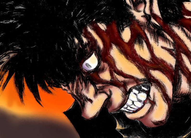
Thanks for the coments folks. I tried to fix the blood a little (hit refresh if you don't notice anything). Still not sure if it came out perfect, but it is a bit better I think. I tried to make it look thick before, but I guess most of the blood has already trickled down his face or mixed with his sweat and become less thick.
@ CnC: Yeah, definately better. I'm a changed man .
.
Anyway, I think I'll attempt a spread next, maybe two in a row actually (one seems a bit easy). The first should come soon, but the second might take a while. I have some other old ones in the works, but I have issues focussing .
@ CnC: Yeah, definately better. I'm a changed man
.Anyway, I think I'll attempt a spread next, maybe two in a row actually (one seems a bit easy). The first should come soon, but the second might take a while. I have some other old ones in the works, but I have issues focussing
.Can't wait to see the next works from ya! thats better on the blood w/ the light source! keep it up Vax!
Vaxillus said:Thanks for the coments folks. I tried to fix the blood a little (hit refresh if you don't notice anything). Still not sure if it came out perfect, but it is a bit better I think. I tried to make it look thick before, but I guess most of the blood has already trickled down his face or mixed with his sweat and become less thick.
@ CnC: Yeah, definately better. I'm a changed man
Yea the shading of the blood is better. Considering this is an abstract drawing and theres blood almost everywhere on his face, its pretty much good enough as is.
Good job.
Vaxillus, nice job on the last piece!
Although I must say the orange bg is way too bright imo. Maybe you should make it a tadd less saturated in combination with another tint/color. Whatever, just try different bg's, I know you can do better than that. I personally think you should watch out with the softbrushes you put on the face (between all the blood). I mean; it's too obvious you gave some brushstrokes here and there, because you can still see some 'white' from the original image (if it isn't it's still too light).
Don't know if I make sense right now, if not I'll come back and post some new replies.
I'm giving some harsh crits here because that's good for leveling up your skills, doesn't mean I don't like the piece...
Rickert said:Although I must say the orange bg is way too bright imo. Maybe you should make it a tadd less saturated in combination with another tint/color. Whatever, just try different bg's, I know you can do better than that. I personally think you should watch out with the softbrushes you put on the face (between all the blood). I mean; it's too obvious you gave some brushstrokes here and there, because you can still see some 'white' from the original image (if it isn't it's still too light).
I disagree.
The brighter background makes the armor and hair pop out more. If it were more desaturated those two things would begin to get lost in the background.
And unless you're talking about the teeth and eye, I don't see the white you're referring to.
Vaxillus
The one and only severed head
Try adjusting the gamma on your computer, it looks fine to me. If you mean the hair, that was left ther on pupose to represent some of the reflections the hair gives off. Still, I was very unsure what to do about it, there was probably a better way to handle it.
Sorry about the gums, I'm never sure exactly how to color them. I'll use a reference next time.
Anyway, the gigantic flaming Karma Sphincter:
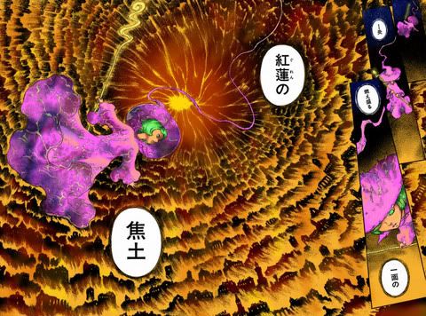
Came out ok. Thought it would look better, but I could probably spend a bit of extra time to improve it. Not now though.
Edit: Phtobucket thought the original was too big and resized it. I'll try to get a slightly larger version up in a bit.
Sorry about the gums, I'm never sure exactly how to color them. I'll use a reference next time.
Anyway, the gigantic flaming Karma Sphincter:
Came out ok. Thought it would look better, but I could probably spend a bit of extra time to improve it. Not now though.
Edit: Phtobucket thought the original was too big and resized it. I'll try to get a slightly larger version up in a bit.
Vaxillus said:Came out ok. Thought it would look better, but I could probably spend a bit of extra time to improve it. Not now though.
Dunno.
It works as a coloration, and looks good. It needs more tho.
Shierke is shaded very simply and with a great deal too much saturation. There doesn't seem to be much consideration for her environment in terms of how she's lit (the descent would be a good opportunity to show that).
Plus the flames need more variance in their color, it kinda looks like just a gradient right now.

Majin_Tenshi
The can opener went bye-bye...
Vaxillus said:Anyway, the gigantic flaming Karma Sphincter:
http://img.photobucket.com/albums/v682/Vaxillus/Berserk/karmafire.jpg
Came out OK. Thought it would look better, but I could probably spend a bit of extra time to improve it. Not now though.
A few suggestions... I think the whole picture needs to be darkened. The fire wheel didn't strike me as a "nice" entity, closer to borderline evil. As for Shirke, she stands out too much. Its almost like she isn't even there. While technically she is in an alleyway, the way her magic works, she is effectively RIGHT IN THAT MAELSTROM. If you added more red (or removed the other colors accordingly) she would seem more like part of the picture rather then like she was overlayed on top of it.