All Sold Out. 30 / 30. 
Thank you to ALL that made this project possible!!! James and I are so thrilled people responded the way they did. I hope everyone that participated and that bought a helmet is 100% satisfied. Let's make the same happen for the Skullknight helmet too!
List of owners:
1. DirectDK
2. Bruhaha69
3. Nirvana
4. Cucu4coco
5. Lithrael
6. Maiku
7. Grovel
8. HITreza
9. Fusiongt
10. The Beast of Darkness
11. Wenjamin
12. Bashar
13. Wahaib
14. DenishWang2001
15. MarkG
16. Indio
17. Kodam
18. Hozer
19. Ebay Buyer
20. Ebay Buyer
21. Turkitage
22. Manjou
23. Houngim
24. Ckd5989
25. Shautieh
26. CWalls
27. Ryuu
28. TheBrandedMan
29. Zoliv
30. Chimaera
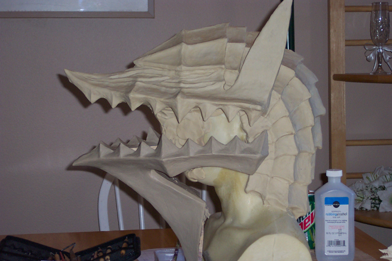
Here are the latest shots and video, 5/21/09!
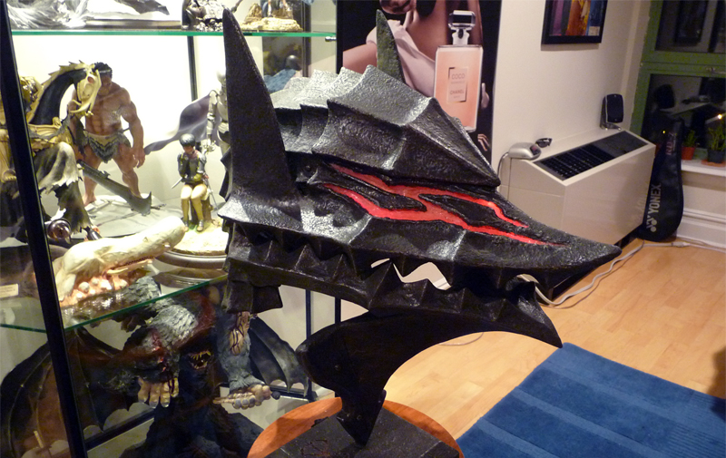
1900 x 1200 version
YOUTUBE LINK
DOWNLOAD FULL-RES LINK
Thank you to ALL that made this project possible!!! James and I are so thrilled people responded the way they did. I hope everyone that participated and that bought a helmet is 100% satisfied. Let's make the same happen for the Skullknight helmet too!
List of owners:
1. DirectDK
2. Bruhaha69
3. Nirvana
4. Cucu4coco
5. Lithrael
6. Maiku
7. Grovel
8. HITreza
9. Fusiongt
10. The Beast of Darkness
11. Wenjamin
12. Bashar
13. Wahaib
14. DenishWang2001
15. MarkG
16. Indio
17. Kodam
18. Hozer
19. Ebay Buyer
20. Ebay Buyer
21. Turkitage
22. Manjou
23. Houngim
24. Ckd5989
25. Shautieh
26. CWalls
27. Ryuu
28. TheBrandedMan
29. Zoliv
30. Chimaera
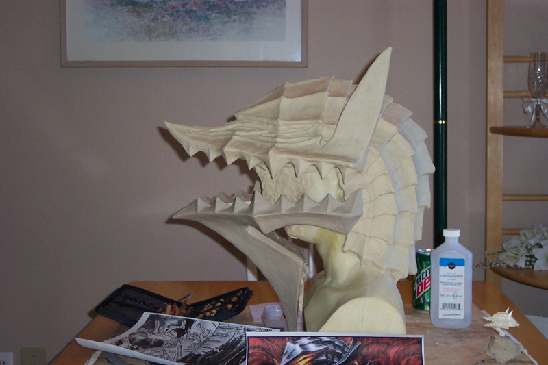
Here are the latest shots and video, 5/21/09!
1900 x 1200 version
YOUTUBE LINK
DOWNLOAD FULL-RES LINK
ORIGINAL POST / BACKGROUND INFO said:Ok, fellow Berserk fans! Some may have recalled I hinted at a cool new collectible/project a few weeks back... Well! I am here now to tell you all about it, and you're gonna dig it!
A few months ago I met someone who builds replicas of various props from TV shows, namely the Sci-Fi show, Battlestar Galactica (any fans on the boards???). For those that don't know, BSG is one KICK-ASS show and easily my favorite tv drama ever. I highly recommend it to everyone, even if you don't like sci-fi stuff (it doesn't even feel like a sci-fi show anyways).
But back to that someone... his name is James Perkins and he had sculpted several 1:1 scale replicas of the various helmets from BSG. They. Are. Amazing. This guy is one talented sculptor, and not only that, he molds/casts and paints as well. Truly a rare find! I recently received his last cylon centurion replica and was BLOWN AWAY. Here are some pics of what it looks like, and also a video I filmed of it last night.
Reference Shot
Video (MUST WATCH!)
Finished Pics
Front
Profile
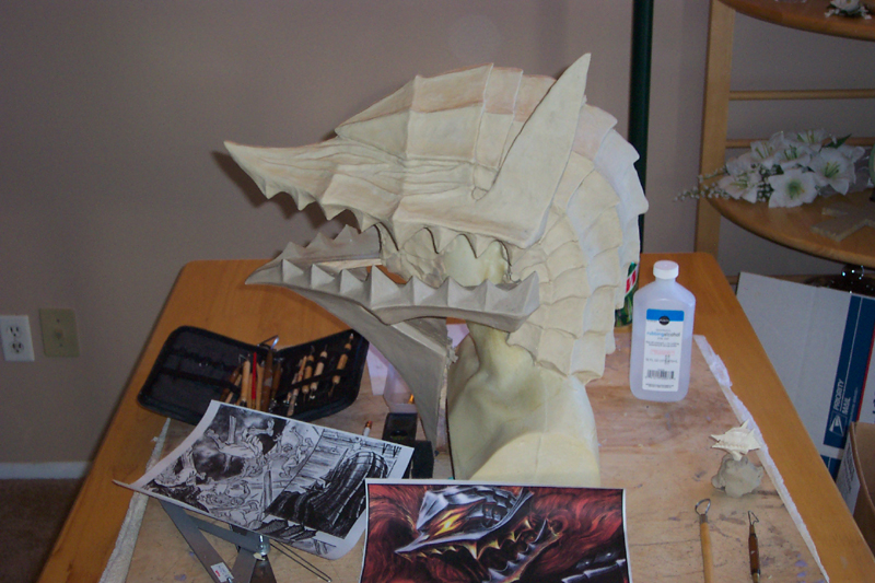
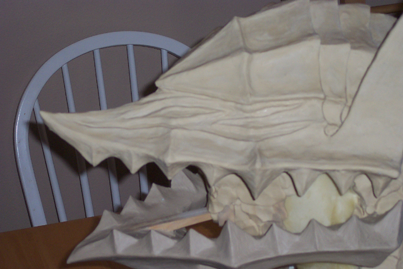
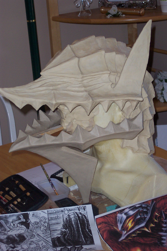
In-Progress Pics
WIP 1
WIP 2
WORK-IN-PROGRESS FORUM THREADS
Cylon Centurion
Viper Pilot
Where am I going with this??? Well, naturally, A BERSERKER HELMET REPLICA!!! I discussed a commission with him and he is beyond ecstatic to work on it! He even went out on his own accord and got a hold of the DVDs and manga, and has already dove in the story. In fact, he is a new fan.
In regards to the design, well there are 2 types of Berserker helmets in my mind. The realistic one (like the one on cover 31), and the pumped up crazy one. Hehe. I'm more inclined to go for the latter, because it's more what we are used to seeing, I really like the Z-shaped glowing red eyes, and I just feel like it's more interesting to look at. What do you all think?
As far as reference photos go, if anyone has any GOOD ones they can lead me to, that'll be awesome. For now, since it'll be very useful for James to have a 3D model to use as a reference, I will be mailing him the 1/8 Berserker kit by Headlong. For those that don't know, this is what it looks like:
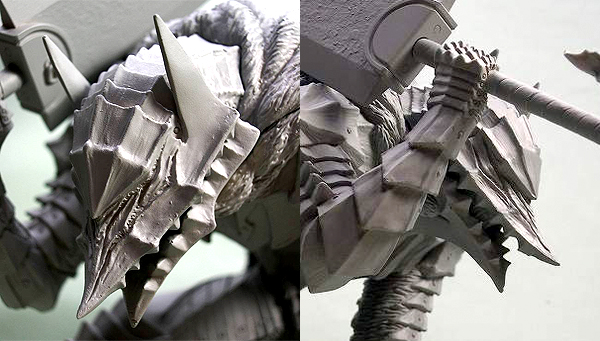
Painted up shots HERE
To me, this looks like the most accurate helmet, so I think it'll be best to use this as the reference. Again, if anyone else has suggestions, please share them with us.
He is ready to start sculpting the helmet at anytime, but of course, it's only worth it if there are other people who are interested. He can make anywhere from 20-30 per mold (and he says not to worry about loss of detail in the later casts). The final product will be made of high quality fiberglass (better than resin of course), and be 1:1 scale. For this particular helmet, he can also customize the eyes to glow red! As you can see from the centurion replica video, he has experience with lighting as well. Can you just imagine how AWESOME this will be?!?!
Moreover, he will assemble the replica and paint it all himself!!! According to him, if we get between 10-15 orders, he can finish assembling/painting all of them within 6-8 weeks AFTER the mold is done.
So of course, the question you guys are probably wondering is HOW MUCH? If we get 15 people to go in on this, then it'll be roughly $475 each. If we get even more than 15, then the price will go down. But seriuosly... $475, my friends? That is an amazing price for a custom sculpted life-size Berserk replica, fully painted and all!
He's not asking for any down payments, but if he's going to start sculpting, he'll need to know the general interest of the community. I told him I'm sure that there are several collectors here that would be interested, so don't make me out to be a liar! =P
Lastly, I have a feeling this is going to turn out to be SWEEEEET. Meaning, after this one is done, we can move on to a Griffith/Femto helmet replica, or maybe even a Skullknight replica. Can you imagine the awesomenessssss???!
So, who's in?!


 I need to go get a job! God, I hate being a full-time student...