Griffith
With the streak of a tear, Like morning dew
When episodes of Vagabond are compiled into a volume, new pages are sometimes added, but also, old pages and panels are touched up or redone altogether. The results vary, it can be very subjective, and can change the entire feeling of a scene, which is why I think Inoue does it, more than anything to do with the quality of the art itself. Anyway, I've got mixed feelings on the practice, and before I get to the latest in volume 28, and particularly Matahatchi, here's a prominent past example for me, from volume 22:
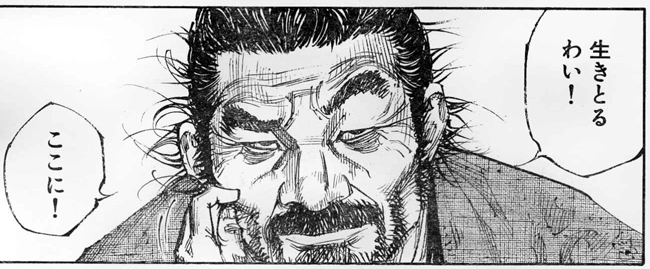
The context of this scene is that Denshichiro asks Musashi how his brother Seijuro fought and Musashi basically insults him and says that he was much stronger then Den, who is set to Duel Musashi in a few days. This is Den's reaction, first the original, then the retouch in the volume:
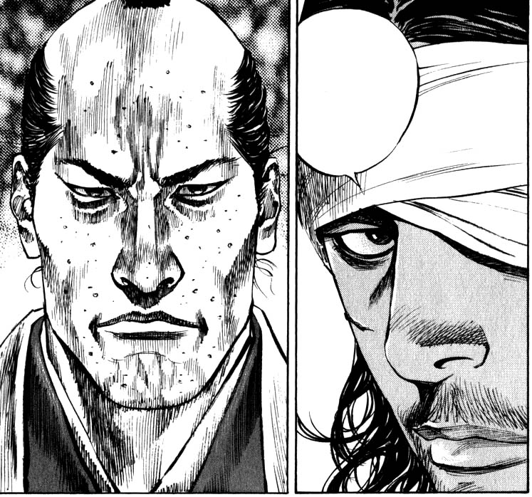
This REALLY jumped out at me when I saw it in the volume, and I didn't like it. I feel like it was meant to strengthen Den or at least make his reaction more neutral, but I feel like it robbed some of the natural emotion from the scene (Den having lost his brother and having it thrown two-fold in his face). I don't know, I've come around a bit on it since then, the emotion is there, but it's more subtle, and it's not like Den should look like he's going to start crying in front of Musashi.
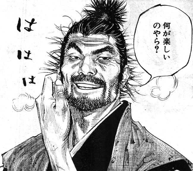
In this scene, Matahatchi is revealed minus his "sophisticated urban style" facial hair and 'do:
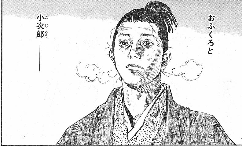
What a nice looking boy. I really liked this panel. Then, in the volume...
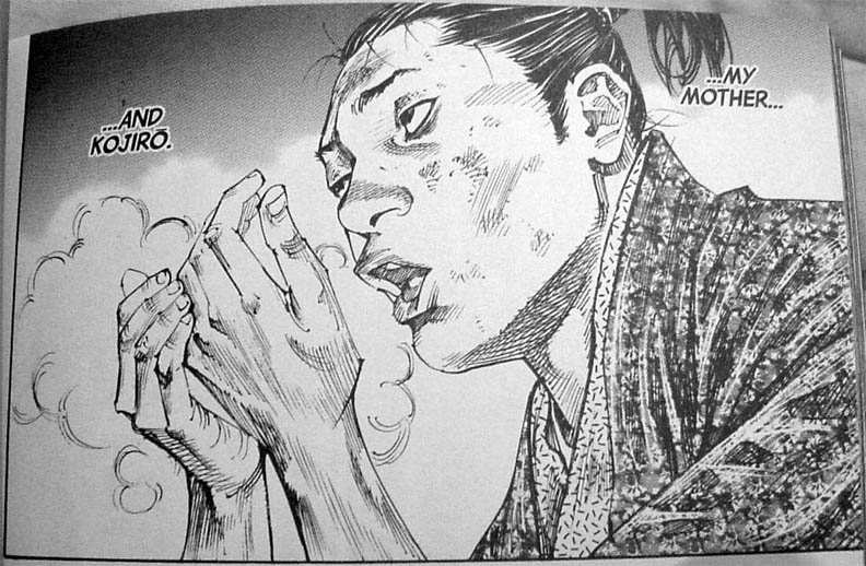
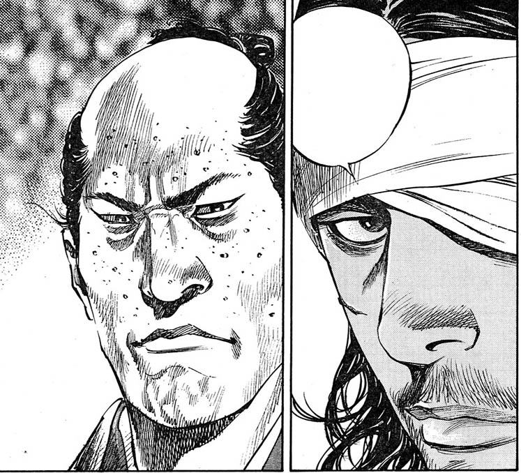
Holy shit, what happened? Should he look uglier then he even used to without the facial hair, especially since it's supposed to represent his getting better? At first I thought this was another character! Didn't even look like Matahatchi to me, and quite honestly, it's the most I've felt sorry for him. I feel like his redemption has already taken a step back with this change, like Inoue is saying, "Not so fast!" Anyway, really bugged me, it's actually why I started this thread, as it was nice to see his more innocent looking face again, but now that's been replaced with a mongoloid...
In case you can't tell, I feel like it went from a solid B to a D-, but even in the process of making this thread, I'm starting to come around on the new more dynamic image... still, as with the Den example, I liked the old one to begin with, so it's a tough pill to swallow.
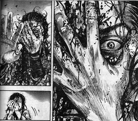
We'll end on a high note, at least from an art/retouch standpoint. Musashi has just been informed that due to his injuries he can live by the sword no longer. In close up behind him appears a smiling spirit of Ueda, who gave him the fateful wound, and then below that appears this panel.
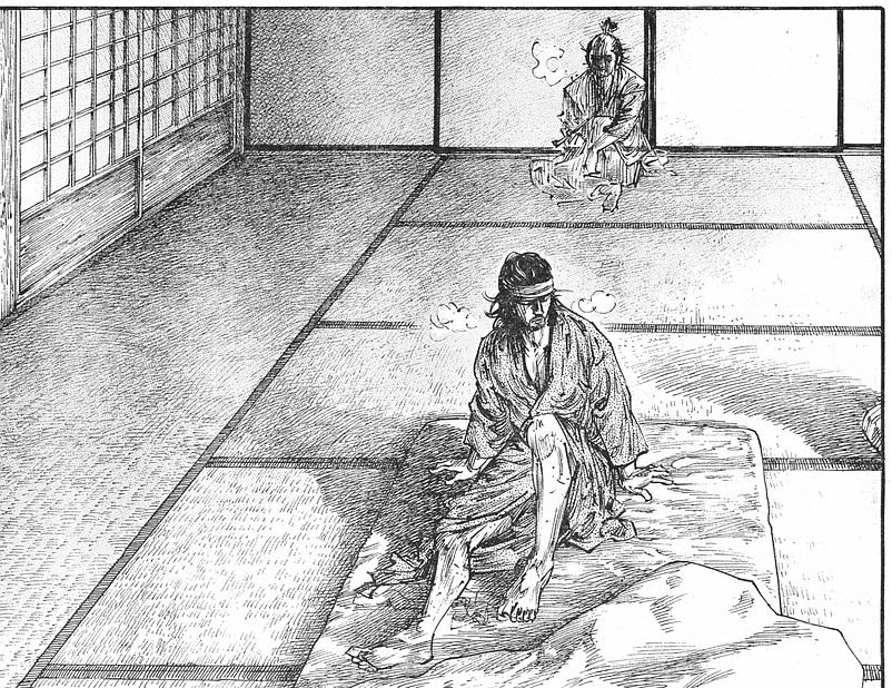
And in the volume:
I like this change. I didn't even notice that the second Ueda ghost was missing until I thought about it, I think because of the angles and vibe of the new panel make his presence, or that feeling, even stronger (part of that may because I've already seen the other of course). And aside from doing that better, it just works on so many other levels the other one didn't touch. Bravo, Inoue.
Please give me your feedback on these agree or disagree, or any other panels, retouches, or new pages you have thoughts on.
The context of this scene is that Denshichiro asks Musashi how his brother Seijuro fought and Musashi basically insults him and says that he was much stronger then Den, who is set to Duel Musashi in a few days. This is Den's reaction, first the original, then the retouch in the volume:
This REALLY jumped out at me when I saw it in the volume, and I didn't like it. I feel like it was meant to strengthen Den or at least make his reaction more neutral, but I feel like it robbed some of the natural emotion from the scene (Den having lost his brother and having it thrown two-fold in his face). I don't know, I've come around a bit on it since then, the emotion is there, but it's more subtle, and it's not like Den should look like he's going to start crying in front of Musashi.
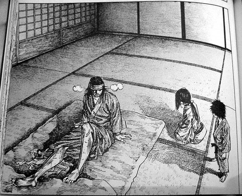
In this scene, Matahatchi is revealed minus his "sophisticated urban style" facial hair and 'do:
What a nice looking boy. I really liked this panel. Then, in the volume...
Holy shit, what happened? Should he look uglier then he even used to without the facial hair, especially since it's supposed to represent his getting better? At first I thought this was another character! Didn't even look like Matahatchi to me, and quite honestly, it's the most I've felt sorry for him. I feel like his redemption has already taken a step back with this change, like Inoue is saying, "Not so fast!" Anyway, really bugged me, it's actually why I started this thread, as it was nice to see his more innocent looking face again, but now that's been replaced with a mongoloid...
In case you can't tell, I feel like it went from a solid B to a D-, but even in the process of making this thread, I'm starting to come around on the new more dynamic image... still, as with the Den example, I liked the old one to begin with, so it's a tough pill to swallow.
We'll end on a high note, at least from an art/retouch standpoint. Musashi has just been informed that due to his injuries he can live by the sword no longer. In close up behind him appears a smiling spirit of Ueda, who gave him the fateful wound, and then below that appears this panel.
And in the volume:
I like this change. I didn't even notice that the second Ueda ghost was missing until I thought about it, I think because of the angles and vibe of the new panel make his presence, or that feeling, even stronger (part of that may because I've already seen the other of course). And aside from doing that better, it just works on so many other levels the other one didn't touch. Bravo, Inoue.
Please give me your feedback on these agree or disagree, or any other panels, retouches, or new pages you have thoughts on.