You are using an out of date browser. It may not display this or other websites correctly.
You should upgrade or use an alternative browser.
You should upgrade or use an alternative browser.
Casca Hand/Sharpy Renditions
- Thread starter Death May Die
- Start date

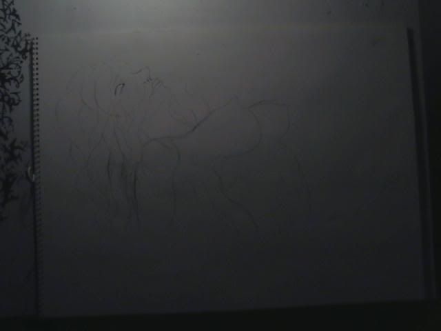
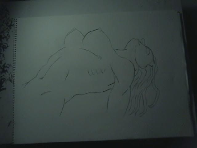
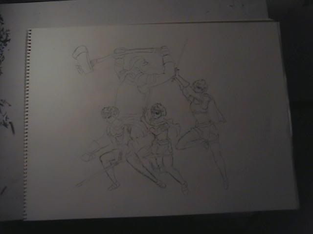
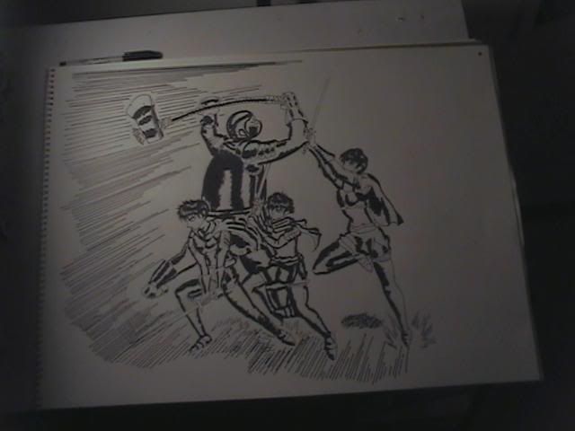
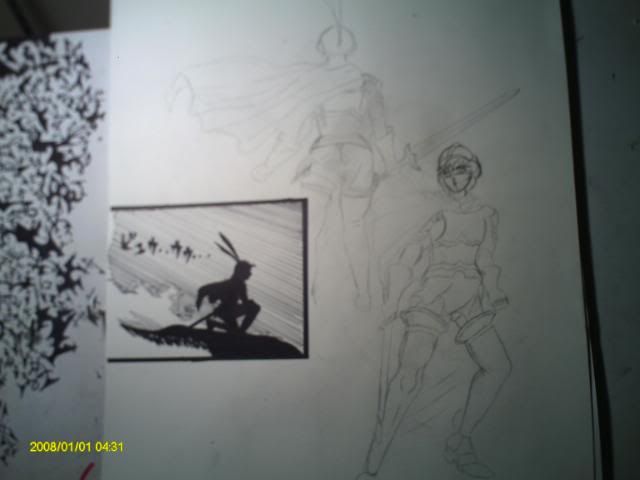
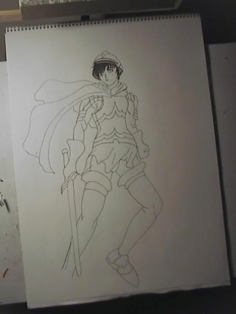
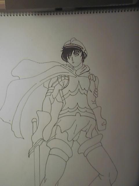
Death May Die said:I'm using a few reference panels and on top of that. Also I will be working with a simple angle, so the amour won't have a weird perspective that's hard to put on paper. I hope it goes well. Hopefully it will be up Sunday.
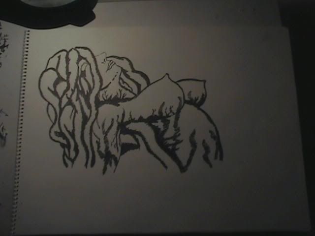
Man talk about the day that never comes ha! I mostly don't do request. But Slan69 and deathbybears had requested Slan rendition's. So here it is. I haven't draw since June 26th. So this one turned out alright.
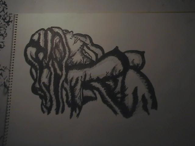
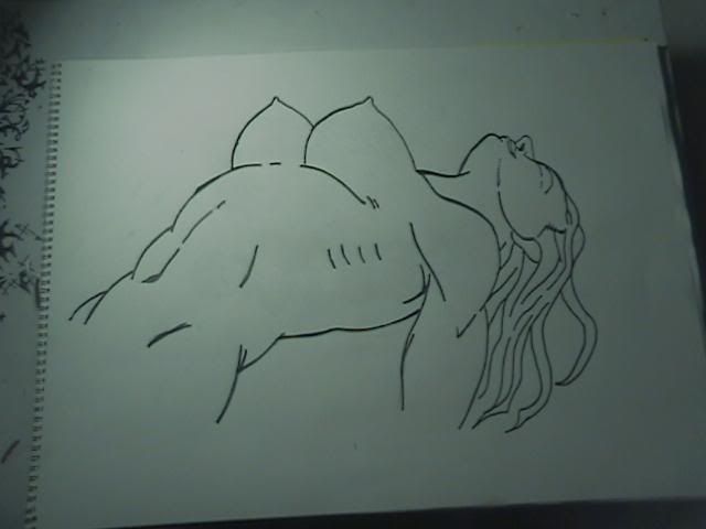
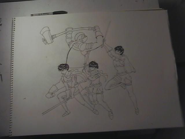
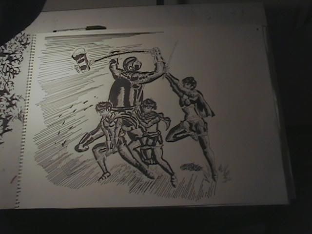
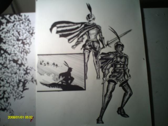
Trying to get back into it. Here is the 2ND follow up.
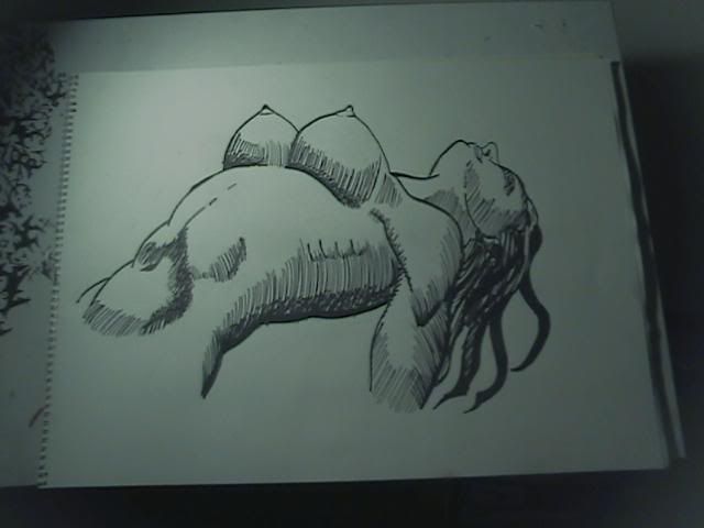

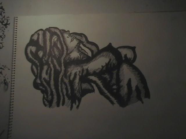
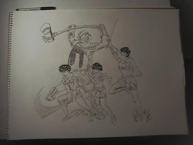
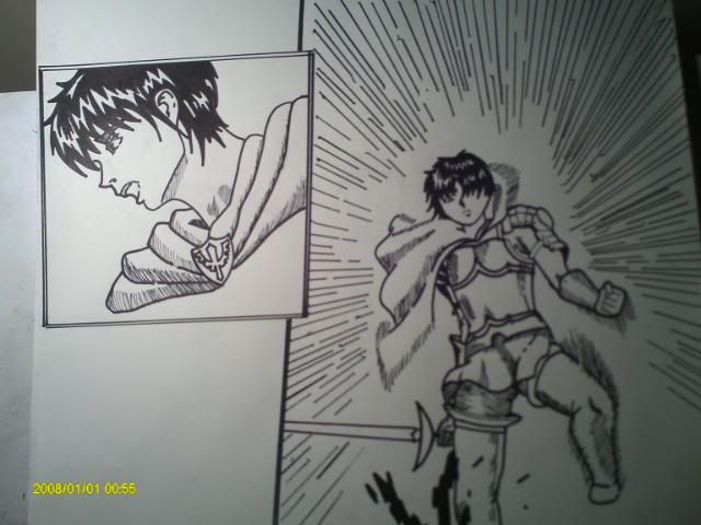
I was on a bit of a roll, so I did a 3rd follow up.

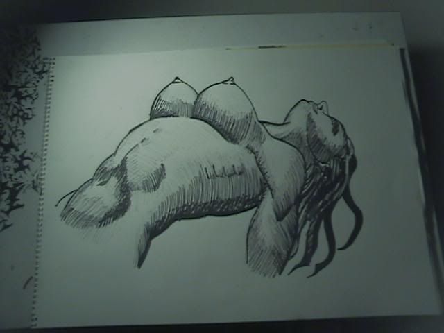
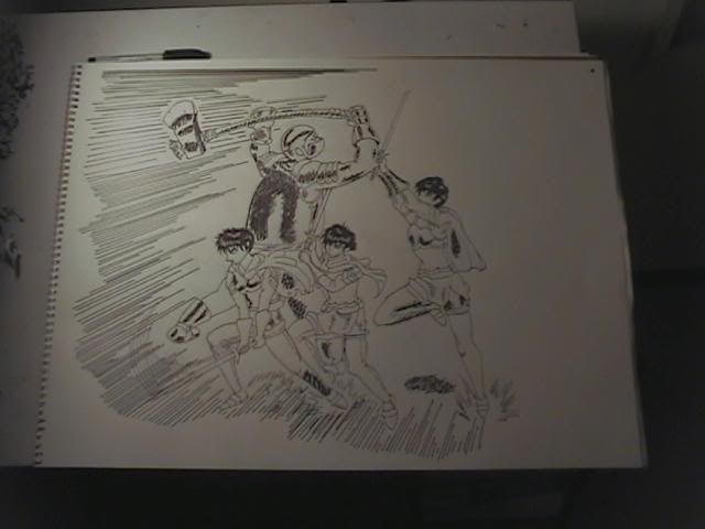
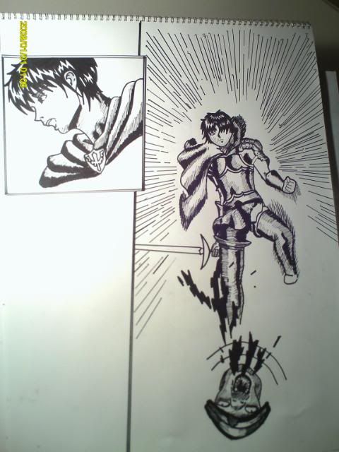
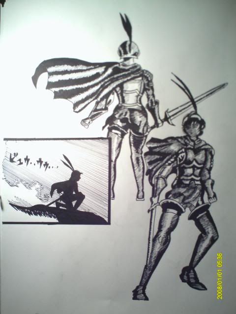
This one was a quick one, the original image was kinda hard to make out, so I really didn't know where I was going with it. (Could say that with everything I do really.
 ) But I thought it was worthy of posting. I liked it.
Gobolatula
praise be to grail!
I love these drawings. Slan is looking particularly great!
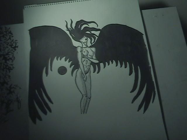
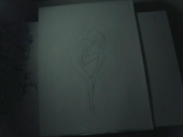
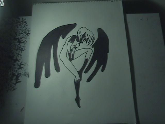
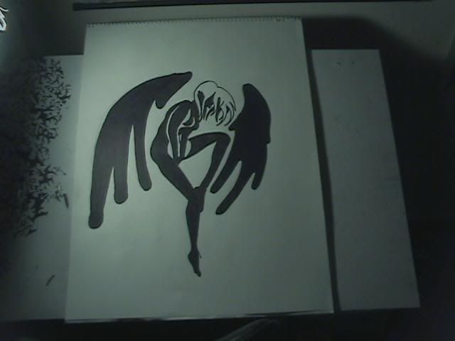
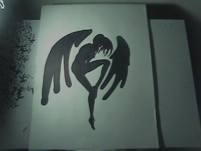
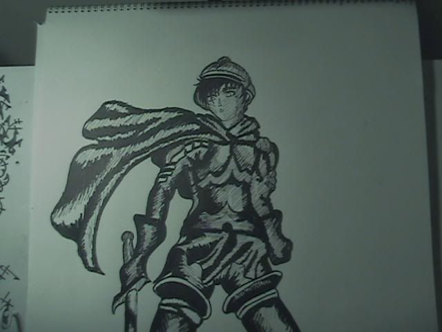
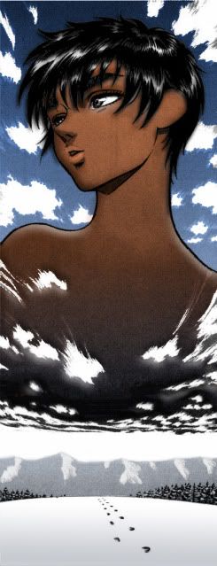
Thank you! :) Slan was a fun way to get back into the game. I'm starting my favorite Berserk character Casca back up.  I picked a rather difficult one to redo. I wish I took better photo's in its stages. I used the photo feature on my digital video camera, which sadly took out some of the quality of the pictures. I'm happy I at least pulled through this one considering the composition was a little above my talents.
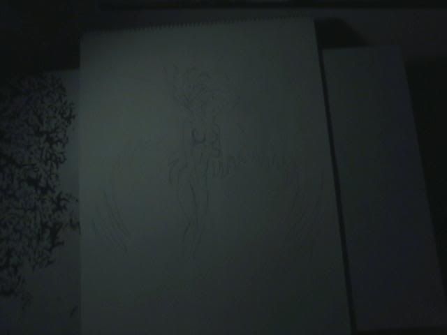
I noticed I never mentioned this, I work on 18' by 24' drawing pads.
I picked a rather difficult one to redo. I wish I took better photo's in its stages. I used the photo feature on my digital video camera, which sadly took out some of the quality of the pictures. I'm happy I at least pulled through this one considering the composition was a little above my talents.I noticed I never mentioned this, I work on 18' by 24' drawing pads.
Aphasia
ALL MYSTERIES MUST BE SOLVED
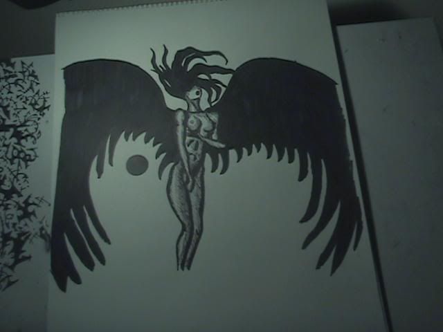
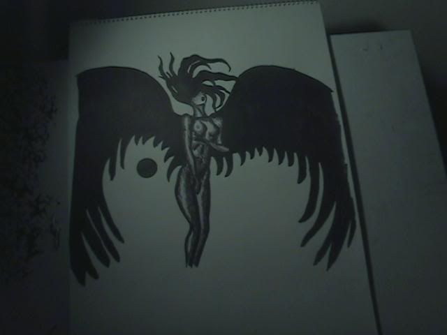
Great work on all these! You're improving as you go along. : D however, keep in mind that part of being a good artist is having the eye to recognize when something is done, I've thought that several of your pieces were considerably stronger before you went in and added a bunch of really dark confusing shadows which seem to take over the drawing and produce a confusing light source. The 4th picture you posted on the one of slan leaning back was the best. The dark shadows just overwhelm and make it look like you used too much ink. Try using dramatic shadows on one side of your model - using shadows on both sides, or on all the lines confuses the viewer. However! it is very good work and your getting better. Keep it up! ;)
Aphasia said:Great work on all these! You're improving as you go along. : D however, keep in mind that part of being a good artist is having the eye to recognize when something is done, I've thought that several of your pieces were considerably stronger before you went in and added a bunch of really dark confusing shadows which seem to take over the drawing and produce a confusing light source. The 4th picture you posted on the one of slan leaning back was the best. The dark shadows just overwhelm and make it look like you used too much ink. Try using dramatic shadows on one side of your model - using shadows on both sides, or on all the lines confuses the viewer. However! it is very good work and your getting better. Keep it up! ;)
I understand man. I've said it before, but I like to make mine darker than the usually bunch.I'm going Volume to volume (currently on 8 now) and picking out my favorite panels and such. I will admit, I haven't master it, but I do like to darken things out. More so I like a more "Threshold" type style. I know I have messed up on a lot of these. What sucks it once you mess up with marker, its there, you have make it work. So, some of these works I do to kill time, some I do to enjoy, some are goals. Like this next one I'm about to post.
Thanks everyone for the complements, and thank you seriously for the advice. I know it doesn't show in the work yet, but definitely I hear your "suggestions" in every pin stroke. I ask my self "will they like it" "will I like it" and maybe that's the answer to why I go a step or two further than most prefer.
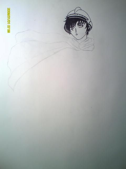
I have tried 4 times to do this composition from Volume 7. It has Casca looking down, with a foot forward. Her face has a tiny upward angle and it killing me. Its my goal to take another show at this panel, because its one of my favorite poses of her.
UPDATE 2/26/2010
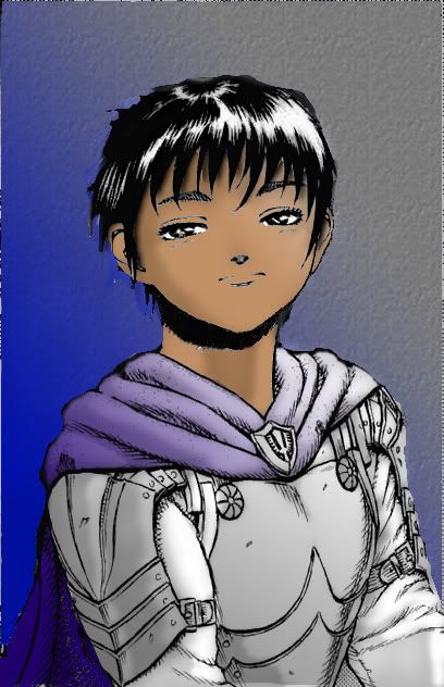
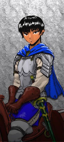
I'm starting a photoshop series of Casca. I need to get better at photoshop and get this coloring and shading thing down. Eventually, I will like to re-draw the original and color it. But for now, I'm going to happily use Miura's originals. I need to thank CnC, his tutorial really helped me get started faster. Here's the first. I just wanted to start out simple. I like the way it turned out.
X
Xem
Guest
I absolutely love that picture you colored of Casca. =) Good choice.
A couple things I'm sure you're probably aware of already. The white lines in the eyebrows/nose/chin/ears should be filled in. I'd probably make her cape a bit darker, near your light source it almost seems the same color as her armor, and maybe add a little "shine" to her armor.
Great work!
edit: I like how you shaded underneath her hair and armor, maybe you should try that type of shading on her neck also, the solid lines don't seem to match up with the rest.
Ah yes, here we are:
Behind the scenes stuff.
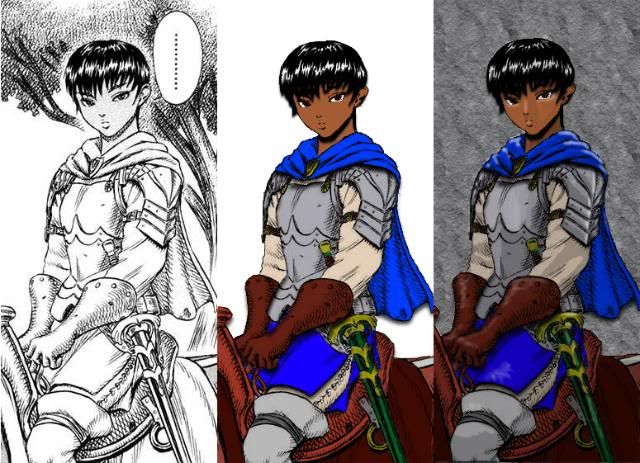
I had a lot of fun with this one. About a 4 1/2 hour project. I was suggested to try to give a more of a glare effect. Which, I think I kinda failed at. I really like the way it turned out though, I just hope the glares in it don't make it resemble "shinny rubber" too much.
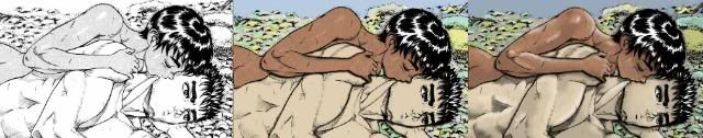
I re-re-did my first Casca Photoshop attempt.
THE OLD

THE NEW!
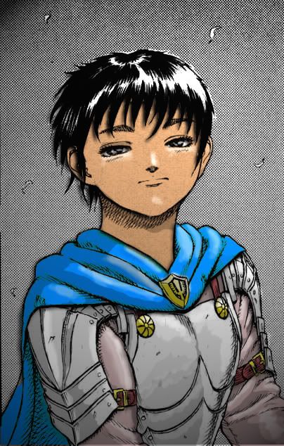
Process:
Behind the scenes stuff.
I had a lot of fun with this one. About a 4 1/2 hour project. I was suggested to try to give a more of a glare effect. Which, I think I kinda failed at. I really like the way it turned out though, I just hope the glares in it don't make it resemble "shinny rubber" too much.
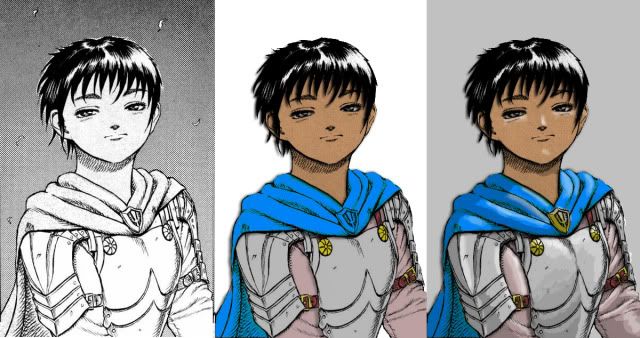
I re-re-did my first Casca Photoshop attempt.
THE OLD
THE NEW!
Process:
Grail
Feel the funk blast
Looking good! It seems like you're getting the hang of how to use layers, which is probably one of the most important aspects of learning how to do digital art properly, in my opinion. I made the mistake of trying to stick everything in one layer when I got started, and I can tell you that it's not worth the trouble!
Anyway, I look forward to seeing more.
Anyway, I look forward to seeing more.
Seriously thanks guys! 
I'm trying to slowly give myself new challenges and bigger panels.
I thought it would take longer to do this one, but it a little shorter than the others. They're going to start getting harder from here on out.
I will see to it we will have (some sort) of a Casca extravaganza!
I have to note, finding the "right" method on layer order, while inquiring drop shadows is pretty challenging. Which, from here, I think that's what I'm going to be working most on.
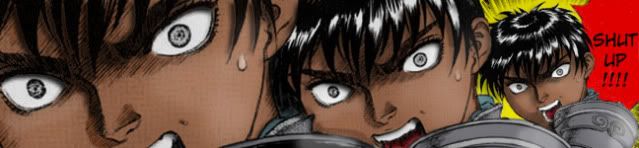
This is one of my favorite panels from the anime btw.
I'm trying to slowly give myself new challenges and bigger panels.
I thought it would take longer to do this one, but it a little shorter than the others. They're going to start getting harder from here on out.
I will see to it we will have (some sort) of a Casca extravaganza!
I have to note, finding the "right" method on layer order, while inquiring drop shadows is pretty challenging. Which, from here, I think that's what I'm going to be working most on.
This is one of my favorite panels from the anime btw.
X
Xem
Guest
Wow, keep at it, pretty awesome! You'll have to change the title of the thread again soon.
I have to agree with Aaz also, you should do something with the hair, it's a bit too obvious it's untouched in the white areas.
I have to agree with Aaz also, you should do something with the hair, it's a bit too obvious it's untouched in the white areas.
I'm in a groove, and if you can't tell by my hand/sharpie renditions, when I'm on a roll, I tend to be excessive. ONLY DIFFERENCE: THE HOURS. The hand drawings takes about 1 hour average. These photoshop images have me sitting down for 3 hours straight for each. I really love it. void I needed a break from video games.
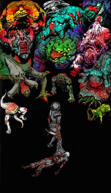
This next one is a achievement for me. It was huge! I did it in 6 hours, without stopping. (Not Joking serpico) It took 41 layers in all to complete it. By far the biggest Photoshop project I've taken up todate. I'm pretty proud of it. I don't know if I can say I took my time on the highlights, just like I mentioned above, I'm got a groove/routine down. But I have feeling I may retouch sometime.
I hope to get a "touch pad" soon and start experimenting more with photoshop as a hands on artist. But for now I give you:
BERSERK CAST
FULL SIZE VERSION HERE
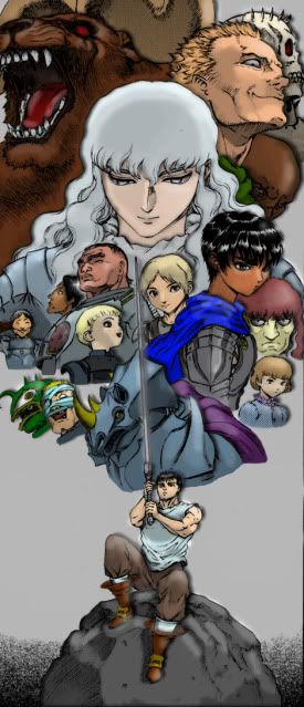
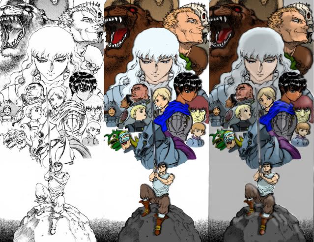
Coloring was by far took the longest:
Here is some other stuff I messed around with over the weekend.
My Sig!
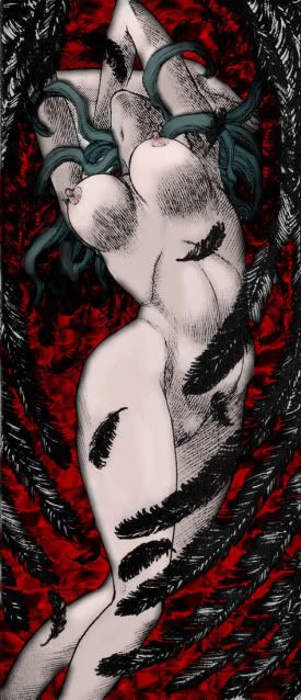
Slan
CASCA: DOOM I was just experimenting really.
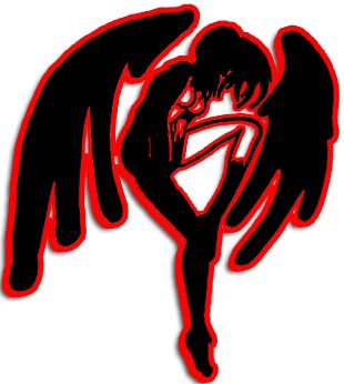
And a Slan Icon
This next one is a achievement for me. It was huge! I did it in 6 hours, without stopping. (Not Joking serpico) It took 41 layers in all to complete it. By far the biggest Photoshop project I've taken up todate. I'm pretty proud of it. I don't know if I can say I took my time on the highlights, just like I mentioned above, I'm got a groove/routine down. But I have feeling I may retouch sometime.
I hope to get a "touch pad" soon and start experimenting more with photoshop as a hands on artist. But for now I give you:
BERSERK CAST
FULL SIZE VERSION HERE
Coloring was by far took the longest:
Here is some other stuff I messed around with over the weekend.
My Sig!
Slan
CASCA: DOOM I was just experimenting really.
And a Slan Icon
You are improving. I can def. see you're more conscious of highlights and light sources.
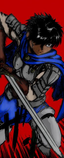
A suggestion for the picture where Guts is holding his sword up and thinks of all the people/creatures in his past. For the bottom tier characters, try using a softer brush so you don't have the abrupt end of color to background. Personally I would let the colors bleed out ever so slightly.
Practice, practice, practice.
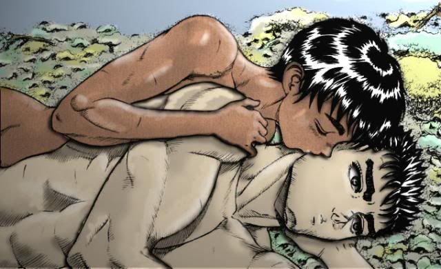
P.s. I'm particularly fond of Casca kissing Guts as they lie down. It's near perfect, just correct the hair like Aaz stated earlier.
A suggestion for the picture where Guts is holding his sword up and thinks of all the people/creatures in his past. For the bottom tier characters, try using a softer brush so you don't have the abrupt end of color to background. Personally I would let the colors bleed out ever so slightly.
Practice, practice, practice.
P.s. I'm particularly fond of Casca kissing Guts as they lie down. It's near perfect, just correct the hair like Aaz stated earlier.
Proj2501 said:, try using a softer brush so you don't have the abrupt end of color to background. Personally I would let the colors bleed out ever so slightly.
I know exactly what you mean, when I will get around to it when I get some time.
P.s. I'm particularly fond of Casca kissing Guts as they lie down. It's near perfect, just correct the hair like Aaz stated earlier.
I'm still trying to figure out a technique to my liking when it comes to the hair. All the hairs are on separate layers, I like to drop shadows. But that's about it, I can't figure out a way to utilize the highlights, Ive been trying to figure that way. For the most part I use the hair highlights to pen point the light source, but sometimes that's not the case.
CCS said:You're getting better with the faces and proportions but try varying the line widths a little and not going overboard on black fills.
I'm not sure what you mean by this, are referring to the photoshop pictures? You would suggest less black and dark shadows? Or you talking about the hand drawings? The photoshop picture proportions are unchanged all together. I just color inside the lines like a 7 year old school child.
I felt like doing 3 small works instead of one big one. I'll try to leave to bigger ones for my weekends when I have a lot more open time to work on them. I am pretty satisfied with the way a lot of these are turning out. So, now I feel like I just need to get the touch pad and bring this stuff full circle.
Aphasia
ALL MYSTERIES MUST BE SOLVED
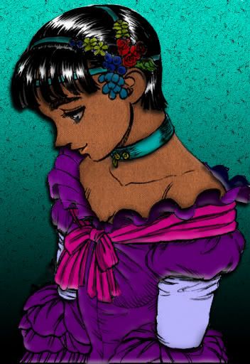
Awesome work! These new colors are looking really good. It looks like you're getting the hang of photoshop. : ) You did a really excellent job on the first Casca. The colors contrast really well. Caska is beautiful in her dress. I still agree that you should lighten your drawings line weight - you can still achieve a heavy "threshold" look without over-doing it. Try using your dark darks sparingly, however your latest drawings are much better than your earliest. : ) Keep it up! Pixels are the new paint!
I would also be conscious on color saturation if I were you. Casca in the uber purple dress feels like someone at Disney is about to slap her on the side of a lunchbox. Just tone 'em down and see what they look like.
And again, you need to work on hair. See your avatar for reference.
You seem to be rushing through these. Forget about quantity. Work on one for awhile, make several different versions trying out different styles.
And again, you need to work on hair. See your avatar for reference.
You seem to be rushing through these. Forget about quantity. Work on one for awhile, make several different versions trying out different styles.
Proj2501 said:I would also be conscious on color saturation if I were you. Casca in the uber purple dress feels like someone at Disney is about to slap her on the side of a lunchbox. Just tone 'em down and see what they look like.
And again, you need to work on hair. See your avatar for reference.
You seem to be rushing through these. Forget about quantity. Work on one for awhile, make several different versions trying out different styles.
Thanks for the suggestions. I still haven't found my solution with the hair. Its a work in progress. But I promise when I do figure it out, I will go back and re-edit all of my former works. (As I have all of my projects saved) You are welcome to post a example! It would help.
But I'm not going to fret over it too much. I liked the Casca dress color choice!
 It fits right in with all the other Disney Princess sticks on my lunch box. I'll use a reference photo next time. The dress color I can tone down as well.
 But I really like the rhythm I got lately. Plus, I'm not choosing the "hardest of hard" panels here. I do take my time, just they're not that hard to make. These are just panels I really wanted to color, not because they present a above average challenge. I feel like it doesn't have to been month project to be a good work of art. (Which to some none of these probably are, but I'm here to present what pleases me.) At least I'm being consistent.
I'm getting the message is post less, more quality. Where as, I would say, it doesn't matter how much I post, the quality is going to be in my taste either way. If my taste is flawed, the work will be flawed. I'm working on my experience, to gain taste, to come through into my art. Plus, posting this stuff encourages me to do more work, whether the works are well received or not. I want to give everyone great results but I have to learn how to do all of this stuff first. I know its not a big deal, just bare with me here for a while. I do plan on coming back and retouching most of these when I feel the time is right.
Hey, don't read my previous post in a negative way buddy. It wasn't intended to be. I get it, you have to work on alot to get 'how' to do it and, you're doing great. Better than I did in the beginning. By all means keep posting mate.
But DO try and work on one panel in multiple styles. You might surprise yourself.

"I find your lack of faith disturbing."
Better than I did in the beginning. By all means keep posting mate. But DO try and work on one panel in multiple styles. You might surprise yourself.
Death May Die said:But I'm not going to fret over it too much.
"I find your lack of faith disturbing."
Aphasia
ALL MYSTERIES MUST BE SOLVED
Style should always come after technique. I wouldn't really worry about style - it's not something you have to search particularly hard to find. Working on the basics and experimenting, learning color theory and layering etc, this will all lead you to your own natural style eventually - I think it's best for the artist to let style flow from them as they see fit, it develops in time and naturally the more you create.
In this way, you won't be "forcing" a style that you like, with time you will really find the style that is actually you. But yes! I'm very impressed with your work. Please keep delivering at your own pace.
In this way, you won't be "forcing" a style that you like, with time you will really find the style that is actually you. But yes! I'm very impressed with your work. Please keep delivering at your own pace.
