DarkDragoon said:
I'm glad someone else is thinking the way I am.
Like you're going to experience the movie in the form of random still frames? =)
DarkDragoon said:
It doesn't look anything at all like Miura's detailed, beautiful art style.
Of course not, but that's not a fair standard to apply to every frame or even shot of an animation (I mean, it would be nice, but c'mon). I don't disagree with your critiques in themselves, just the attention you're giving to something that could just as well be insignificant, if not a non-factor, in the final product.
DarkDragoon said:
Sure it's bright, clean and colorful, but since when does bright, clean and colorful have anything to do with Berserk?
Miura's detailed, beautiful art style when he does color images. I'm only saying because it's kind of a misnomer that everything about Berserk should be painted black.
DarkDragoon said:
The only bright side is that it really does looks like test footage. That shot was made quite a while ago for promotional things, so I can't imagine the finished product will be the same.
I do hope you're right, but again, then you're also making a big deal over a still frame of a wide shot from old test footage. Much ado about nothing at this point. I mean, what did you think of the HD trailer itself, similarly grieved?
DarkDragoon said:
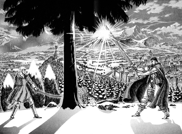
This may be old and grainy, but it definitely looks better http://img.photobucket.com/albums/v42/DarkDragoon/anime.jpg?t=1310749304
NightCrawler said:
I was waiting for someone to post the 97 version. Comparing the two, the older definitely looks better.
Well, aside from the detail size being way different, it
should look better since in that version the characters actually
are still images. =) In this version there's fluid movement, which is the tradeoff, and another reason this shouldn't be judged equivalently with what's essentially still art, since that's not what this is. Having said that, let's do it anyway!
Miura wins! No surprise. As for the other two... not so cut and dry. They each have their positives and negatives when you consider everything like clarity, atmosphere, and fluidity. So yeah, I'm not saying you should jump for joy, just don't jump off a bridge either.
BTW, let me know if you have any requests for comparison.
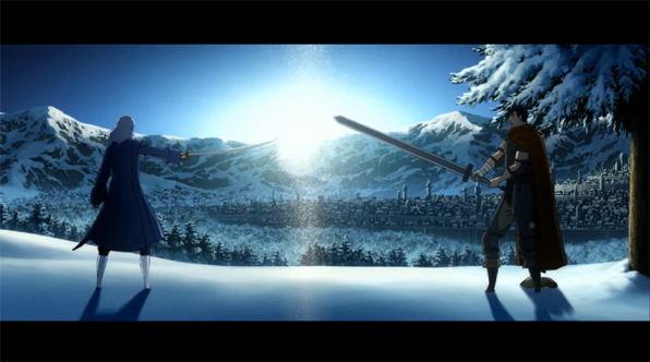
Theoden said:
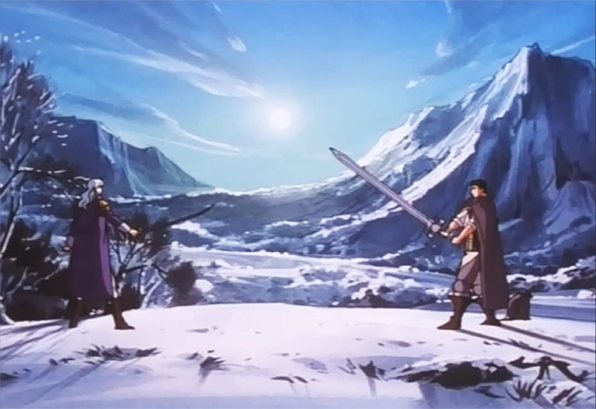
Well on that shot http://www.skullknight.net/griffith/news_bg.jpg
I believe the characters aren't supposed to move or If they do, they move slowly.
I agree with the fact that criticizing a shot in full and fast motion is out of context, but with this shot that I was talking about it makes sense, simply because they are supposed to stay still a moment.
Also, modifying proportions or anything are some trick used in animation style so I understand If sometimes it's really ugly
I think that's a very fair assessment, and I hope it isn't an issue in the final cut.
Theoden said:
but on shots without any moves or slowly ones I think it's not tolerable.
Not tolerable? What are you going to do, edit it out like some
nut!?
CCS said:
There were more skilled traditional animators back then. These days the computer has spoiled everyone unfortunately. It also might be because studio 4C is used to taking liberties with proportions. Just look at Tenton Kinkreet or however you spell that.
I love how political this all is, with two parrallel arguments going on between warring factions of Berserk snobs and anime snobs.