God Hand

Here's some pages I did yesterday.  Let me know what you think.

http://babildo.brinkster.net/Berserk/60%20copy.jpg

http://babildo.brinkster.net/Berserk/62%20copy.jpg

I was gonna go with red for femto but tenchu convinced me to stay true to the manga.

Not bad for a first attempt eh?
 
One more for ya.  This is at the eclipse.

http://babildo.brinkster.net/Berserk/v12p123%20copy.jpg

And another.  Femto's birth.

http://babildo.brinkster.net/Berserk/v13p130%20copy.jpg
http://babildo.brinkster.net/Berserk/v13p132%20copy.jpg

*Edit*
I modified the eclipse in the pics to fix the background's one color look.  I didn't put in any extra work like Jon suggested though.
 
dwarfkicker said:
Come on, bring on the artistic criticism.  Tell me what you like and don't like.  I know it doesn't have the flair of some your guys pics.
Alright then.

First, if its in Layers (which it should be) then set the eraser to 5% and start erasing in the lighter areas on the body, making the armour and stuff shine. Then add more colors, everything isn't one color.

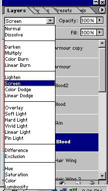
Second, dont be afraid to experiment with one or more styles on the layers style.
Ex:
Layerstyle.jpg
 
I would whip out the dodge and burn tools (for highlight and shadow). You need to really create some more contrast on Femto because he is a heavily lined character and you have a medium-dark blue on him and you lose detail. I had to turn up my brightness to retina-searing-white levels in order to see the eye slits on Femto's helmet in the first pic. Same with Ubik, except it's tougher with him because he's tiny.
Don't be afraid to erase some of the black patches of shadow that are in the original line drawing (create a duplicate layer of the original, hide the original, and work with the copy, just in case). Sometimes they don't give you enough space to create a good balance of light and dark color because an area is half-filled with black (Example, the first pic you linked to, Femto's armor pectorals) -- That's necessary in B&W, but not when you've got a full range of color.

Ubik is also a bit monochromatic with blue-on-blue, I would make his skin tone a lighter blue. Conrad has a similar but lesser problem. A little bit of work on the lighting would probably be enough.

I would add some more detail to the backgrounds too (shading in the Escher-esque dimension to show depth, different color for the light of the eclipsed sun in the face dimension, etc.). I am a detail freak though and you may not care about the background enough.
 
Yeah I figured I would work on the eclipse itself to have a different kind of color coming off of it instead of all read around it.  Like a yellow or orange type deal.


*Edit*
Took care of the eclipse problem.

And incase you perfer a red Femto as opposed to a blue one.

http://babildo.brinkster.net/Berserk/v13p130%20copy1.jpg
http://babildo.brinkster.net/Berserk/v13p132%20copy1.jpg
http://babildo.brinkster.net/Berserk/v3p62%20copy.jpg

Which do you folks perfer, red or blue?
 
Top Bottom