Calling all Artists: New Encyclopedia Banner

Status
Not open for further replies.

Walter

Administrator
Staff member
Ahh, the years have passed so quickly since the Encyclopedia was first born, in Summer 2003. Uriel helped me pioneer the original design for the Encyclopedia, including the still-used menu and the banner that flies above it, this:

title2.jpg

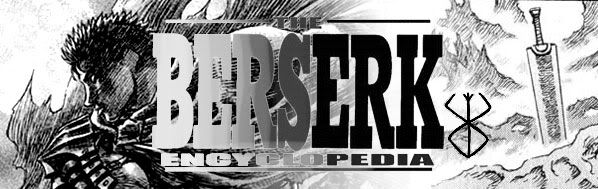
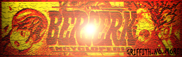
But, now that I've stared at it over and over for years, I'd like something a little more _epic_. I want an image, preferably of the same dimensions (~600x200 pixels) that conveys BERSERK on an epic, grand scale.

While color submissions are fine, they aren't exactly what I'm looking for. Too much color will distract from the content. Besides, without having to color the image, you can focus on composition, which is really the key here.

PS: Also, keep in mind I will be slapping on a "BERSERK ENCYCLOPEDIA" logo in the center of the image.
 
Here is something I put together, it has the contrast I hope you are looking for. ;D

encyclopedia_banner.jpg


- C ;D
 
That's pretty cool Aufond! :) I decided to make another with the armor and the behelit as the main characters, just something a little different. I kinda made it like they were coming from the center of Berserk, or something like that. ;D

encyclopedia_banner2.jpg


- C 8)
 
C, I think we need to keep it black and white(or maybe the same color balance on both sides but definitely not different as here IMO). And the idea of letting it come from the centre(both pics) is a good thing but the dynamic on this one is confusing I think. Because the direction of the image is 'spreading out(?)' but the armour pic goes back to the middle. I dunno it's a little bit disturbing to me it seems, maybe you should try some different versions? It sure is potential. 8) :)

And Aufond, I dunno it really is a cool image, but for some reason not IT. Personally i wouldn't give the logo a gradient (keep it the same). It makes it less clear. And the berserk-sign stands too much of the image, it's a thing apart from it.

Sorry if my critiques are too much or something, my intensions are good;)
 

Walter

Administrator
Staff member
Pretty good submissions so far. But no winners. I forgot to mention this, but don't worry about inserting the BERSERK Encyclopedia logo, I have a seperate PSD for that.

I should reiterate I'm not 100% against color, I just don't want something BLAZING red or BLAZING yellow. If color is added, as long as its properly saturated (as in, hardly at all), it will work fine.

PS: And don't forget EPIC.
 

Griffith

With the streak of a tear, Like morning dew
Wally old buddy, your search for the perfect encyclopedia banner is over! I give you your winner:

winnerbanner.jpg


BTW, can you show me how to turn it into an animated gif? ???​
 
Well, I got off work, was tired, but i decided to mess with a few pictures and came up with these:

One with different characters, mainly made to get people curious as to who they are and where they fit in, of course making them want to read the encyclopedia, (and I know Puella will like it too ;D)
newbann2.jpg

I tried to leave enough room in the middle for the words

Here is a Guts and Griffith one, just a little different blend:
newbann.jpg


Also, I have one a little more simple, which actually makes it quite more epic and will leave some of the newer people in awe or maybe at least just have a few questions, for the encyclopedia :):
epic_banner.jpg


Enough room to put the words on the side. I also have one in the making, it will be quite interesting, but I could use the actual picture of the words or the psd file. If you could send it or post it here that would be great. Hope you enjoy, just trying different things to see what comes out and maybe give you a few different ideas. ;D

- C
 

puella

Berserk forever
Damage Control said:
(and I know Puella will like it too ;D)
newbann2.jpg

Yeah, of course! :D
It's necessary to put Puck, eternal company and superviser of Guts. I know I'm ver partial though. :p

Nice effect, C.
 

TheSkyTraveller

Monster adventures on the high seas!
After staring at it for a while, I think the font for the current encyclopedia logo looks a bit too "wild west."  I tried something a little different.  If the logo needs something more, I could maybe jazz it up a bit graphic design-wise.  If you want something different or want your old logo on there, I have versions of these files with no text.

Here's what I came up with:

guts_grifface2.jpg


guts_grifface3.jpg


guts_femto.jpg


guts_grifface1.jpg


Yes, I did like that panel of Griffith, and yes I was also too lazy to scan images all day. :p

I have one more totally different idea, but I'm still working on it.  Hope you guys like these, I can always revise them if any of them look promising.
 

nomad

"Bring the light of day"
All of them are awesome... seriously, I wish I actually had any talent in the matter  :'(

pimpmygrifflow.jpg


Still Champion. Of all things...It had to be a Corona  8)
 
TheSkyTraveller;

looks really cool man!(I have to be carefull with that 'man'-talk of mine) ;D

No really phat! Especially the first one(AND the second one:)). (maybe an idea to let the right corner -next to griffith on the right below corner--his hair--be filled with a black color too(first pic), so it's more balanced?

Maybe I'll try some stuff too soon...but I doubt if I can 'overblow' this :eek: ;D
 

Aazealh

Administrator
Staff member
That's some neat stuff Sky, especially the 1st and 3rd ones. They're not too far from my own private submissions actually. :p

Rickert said:
looks really cool man!(I have to be carefull with that 'man'-talk of mine)

Yeah, maybe you should check the "gender" icons before posting.

PS: TheSkyTraveller is a woman.
 
Hey this is what i suggest...


encyclopedia_banner2.jpg


guts_grifface3.jpg


Use the the picture of Beast Guts from the 1st banner and merge it with the Griffith face in the 2nd banner...


It might look good... :p
 
Here is something a little different. I didn't have the words you will be using, so i just through some in. I took after Skytraveler and also have the psd file without the words. It is just a simple Guts as the Blackswordsman staring at you in the rain. Epic I thought :).

epic_guts_words.gif


You may not like it animated, but I thought it was cool. If you want me to, let me know and I can, or you can , put the words you have into it and just see what it looks like. Talk to you later.

- C ;D
 

Walter

Administrator
Staff member
redria said:
Yeah, posting the picture of the words would be helpful :)
I'd rather add the title myself. But, if you're DYING for a source image of the title, it's pretty much this. But please keep in mind I do not want the title in your final draft. Sky Traveller's are the best so far, so artists take notes.  Please, no animated GIFs. I know it was just experimentation, but it crashed my browser and that's just no good  8)

And just a rule of thumb, anime pics aren't really the best source material.
 
Here is one I turned the contrast up for a sharp crisp picture. Kind of an epic versus picture, thought it would fit well. :D

sharp_epic.jpg


- C
 
Status
Not open for further replies.
Top Bottom