Everyone now immediately associates the Falcon of Light symbol with Griffith. And for all we know, that is as intended. After all, the falcon of light myth from the Holy See was a perfectly suited role for Griffith to step into, immediately establishing his credibility as a savior figure. How convenient! But as evidenced throughout the earliest parts of Berserk, it does not appear to be something that Miura had in mind from the beginning. Instead, he very slyly inserts it as a foundational piece of the Berserk world's history as if it were there all along. It's only through scrutiny that you can see its evolution.
Now that we've established that Miura chose to insert the Holy See symbol later in the story, the question is: Why change it at all? Why emphasize its design here in Volume 15 for seemingly no purpose?
The design is plainly a bird-like creature, which we later learn is meant to be a falcon (first referenced in Volume 18). I think its appearance in final form in Volume 15 marks the earliest tip of the hand that Miura intended to bring Griffith back as that savior figure. Though not yet explicit, I think subconsciously associating the falcon with a religion was intentionally done to begin bending the readers' outlook for Griffith's future. Looking back, it's kind of incredible that so much was spelled out to readers right there. You can trace a line directly from this reveal in Volume 15 to the pontiff prostrating himself before Griffith in Volume 32 all the way to the role he's currently playing in Falconia.
If you haven't checked it out yet, Aazealh and I discussed all of this at length in Minipodcast 28 over on Patreon. It just took me some time to do all the images and make it into a real post.
If you are on mobile, click each image for a larger version!
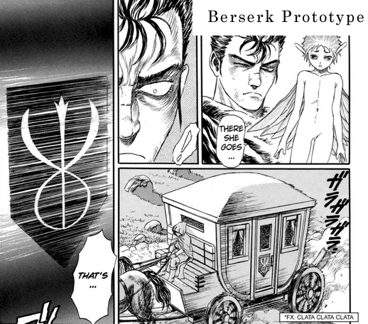
| The Berserk Prototype features the initial design for the brand, which had more contoured lines than the runic-like final design. That's noteworthy because the Holy See’s emblem is also quite contoured.But as you'll notice, it also has the branching, three-pronged crest at the top of the central line. So it’s a bit like seeing Miura’s hand before he dealt out the cards. |
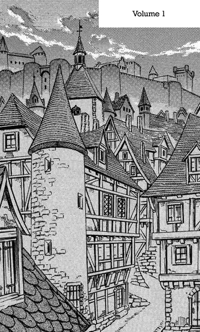
| Volume 1—In Berserk's earliest volumes, you’ll often see cityscapes like this one without any Holy See symbols. Instead you’ll find symbols that evoke Christianity. You can see the tiniest little cross here at the top of a tower. There may be others,but this is the only one I noticed. It's only notable here because it ends up being an inconsistency once the Falcon symbol is finalized, and the knowledge that the Holy See wouldn't tolerate other religions or worldviews on the continent. |
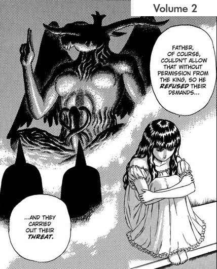
| Volume 2—The shaft of the Baphomet statue from Theresia's memory has a very cadeuceus look to it. But it most clearly evokes the brand, not a falcon, and incidentally, it lacks the three-pronged crest. Also, because it is contoured, it resembles the original brand design from the prototype. |
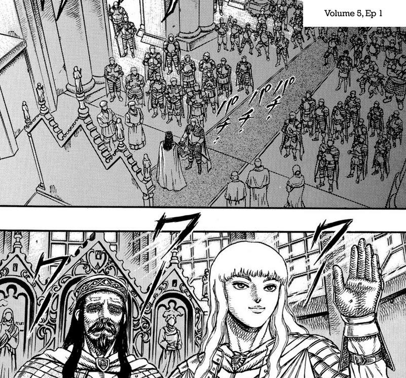
| Volume 5—here in this church setting (called temples in Berserk) is where Griffith became a viscount. You would expect to see Holy See symbols here and there, but instead we see statues that evoke Christian saints. |
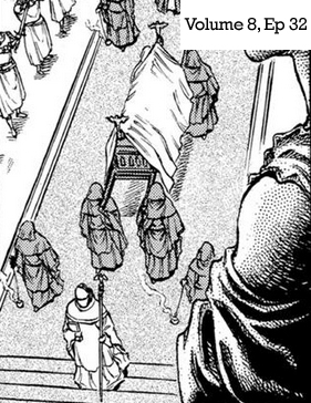
| Volume 8—We see a kind of rough draft for the Holy See symbol during the Queen’s funeral. It’s so small that it’s difficult to make out the exact design, but the falcon is evident, if slightly more angular. Most notable about this early design is that there is not any obvious brand correlation yet, which could indicate that its final design was not meant to parallel the brand, or at least, not so obviously. |
| This one is interesting, but amounts to a bonus detail,since it comes not from Miura, but from the 1997 anime’s version of the queen’s funeral. They used the final holy see symbol. I imagine they were able to course correct this depiction because by the time this episode was completed (late 1997-early 1998), Miura had already finalized the design in Volume 15 in September 1997. Close call! |
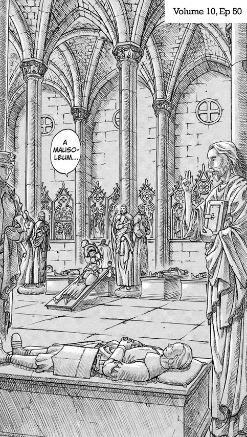
| Volume 10—in the mausoleum, we have another example of a location that should be laden with Holy See symbols, but instead, like Volume 5's temple, is more generically Christian. Its absence is proof enough that Miura wasn’t quite ready to show off a final symbol. |
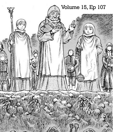
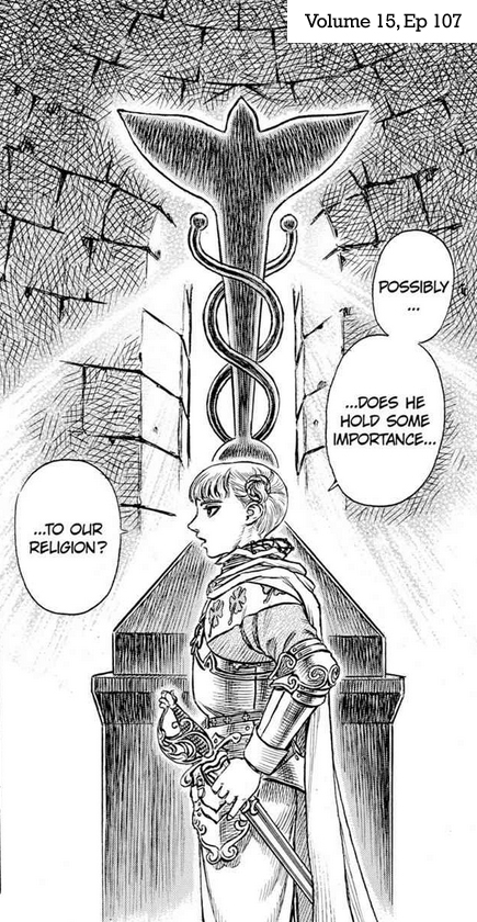
| Volume 15—finally, we get the very first image of the Holy See’s falcon icon! We see a young priest carrying a staff with the symbol on the end. Later, in the same episode, we have a great close-up shot of the Falcon symbol that’s both illuminated by light and enshrouded by it. Perfect! The sinuous, caduceus-like design of the symbol clearly evokes the brand, with the wings and head of the falcon representing the three-part crest on the brand. |
Now that we've established that Miura chose to insert the Holy See symbol later in the story, the question is: Why change it at all? Why emphasize its design here in Volume 15 for seemingly no purpose?
The design is plainly a bird-like creature, which we later learn is meant to be a falcon (first referenced in Volume 18). I think its appearance in final form in Volume 15 marks the earliest tip of the hand that Miura intended to bring Griffith back as that savior figure. Though not yet explicit, I think subconsciously associating the falcon with a religion was intentionally done to begin bending the readers' outlook for Griffith's future. Looking back, it's kind of incredible that so much was spelled out to readers right there. You can trace a line directly from this reveal in Volume 15 to the pontiff prostrating himself before Griffith in Volume 32 all the way to the role he's currently playing in Falconia.
If you haven't checked it out yet, Aazealh and I discussed all of this at length in Minipodcast 28 over on Patreon. It just took me some time to do all the images and make it into a real post.