You are using an out of date browser. It may not display this or other websites correctly.
You should upgrade or use an alternative browser.
You should upgrade or use an alternative browser.
Berserk Saga Project News
- Thread starter Walter
- Start date
silver said:Holy crap. I've been registered for this site for 10 years, and I have only 7 posts
And the previous one was a keeper to say the least.

Voldo said:Could someone who knows more about the movie add it to IMDb? It's not there as far as I know. Would be cool to have a page for it.
http://www.imdb.com/updates?update=title
Not going to do it myself, but I tweeted Clara de Porras about it.
An IMDB entry would be neat.
I apologize for bring this back up but there's an aspect to this assassination topic that doesn't seem to have been addressed.
I can see both sides of the argument. On the one hand Guts is an impulsive, often reckless warrior with a strong attachment to his personal sword, and is really in over his head with a stealthy assassination. His only attempt to stay unseen is by wearing a hooded cloak without armor, and by traveling by roof top. A character like Judeau might've been a better pick for the job as far as being discrete , though we all know Griffith wanted to hide his unsavory side from the rest of the Hawks, and so he chose Guts. The method Guts chooses in the manga says a lot about his one track mind at the time, and is a springboard for his later character growth. He even blows off the choice Griffith gives him and treats it like any other order. So there are many good reasons to keep it the way it the way Miura wrote it at the time.
On the other hand, Guts isn't stupid. He's specifically instructed by Griffith that he can't leave witnesses or be caught, and for good reason. It would be disastrous for Griffith if Guts was identified, and it doesn't seem far fetched for Griffith to take measures to avoid being charged with high treason or regicide. For example, instructing Guts to disguise himself. To the argument that Guts wasn't famous yet, well I'm not so sure. Guts and Griffith were the only known people to survive a massacre by Zodd, a legendary warrior. This caused a lot of gossip and celebrity status for at least Griffith, if not Guts to some degree. I think you can make a case that Guts or his rather unique giant sword might be recognized (especially after Guts nearly assaulted Julius on the steps when Griffith was slapped. Bodyguards were present and probably took notice.)
Is it therefore an unforgivable change to have Guts perform the assassination with something to cover his face, and a non-distinct long sword? It's not as if he's wearing some elaborate assassin mask; it's just a bandanna to cover his face. It doesn't alter the method he takes or the sequence of events, but rather makes Guts seem a little less oblivious as to the trouble he could cause for the entire Band of the Hawk by murdering the King's brother and nephew. He's still stubborn and impulsive by using a big sword to carry it out, and as far as we can tell, he still kills Adonis.
As far as the argument that Guts is so attached to his sword that he would never, ever use anything else... Well, he's shown a willingness as the Black Swordsman to use a variety of weapons to deal with the task at hand, including throwing knives, crossbows, and cannons. This however, could just be evidence of how Guts has grown as a warrior over time.
From my point of view, this is a change that can at least be rationalized quite well, unlike the fact that Guts duels Griffith with his Raider's sword, which implies huge changes with Doldrey. A change like that undermines many bigger issues, such as the stakes of the battle with Boscogn, Zodd's intervention, plus the loss of symbolism when Guts's sword is severed on his last battle for the Hawks. I can't judge it until I see how it's all handled, but this change should cause far more concern.
As others have said, I'm going to view the Saga project as an merely an interpretation of Berserk with it's own take on the story. The same way that everything from The Count of Monte Cristo, Shakespeare, The Three Musketeers, to X-Men, Batman, and Conan have multiple versions. Some of the changes might suck, some might be genuinely interesting. I'm not giving it blind faith, but I won't condemn it from the offset either.
The biggest offense though, as Aaz has been sure to point out, is that the Saga was originally announced to be extremely faithful to the Manga. I just don't consider that to be possible with the run time of three feature films, nor by what we've seen, so I'm just taking the film for what it is: an adaptation that's going to take creative liberties. While that might not be what a lot of us want, in a way it'll allow some measure of surprise as we watch it versus a paint by numbers 1 to 1 copy of the manga. No offense intended.
In the end, I think the '97 anime is going to be the more faithful of the two, despite it's inferior animation quality. At least it attempts to match most of the manga panels, and to me at least, the darker color palette fits the darker tone of the manga anyway. My two cents.
B
BloodyDevil
Guest
WOW ! I really like the new trailer ! The animation is awesome !!! It is very hard to wait until February >__<
I also really like the poster they have done ! It is a very good idea that they choose to show Guts' happiness while he is in the Band of the Falcon (and so before all the suffering he will endure).
I also really like the poster they have done ! It is a very good idea that they choose to show Guts' happiness while he is in the Band of the Falcon (and so before all the suffering he will endure).
Even if he was never actually that happy?BloodyDevil said:It is a very good idea that they choose to show Guts' happiness while he is in the Band of the Falcon (and so before all the suffering he will endure).
 Remember, he only realized what he had as it was fading away. And I can't recall a single time where he was this expressive -- sharing a big, toothy, open-mouthed smile with his comrades after a battle. When Guts shows his teeth, it's normally to be menacing. When he expressed a genuine smile, it's usually just a conservative grin. If you can think of a parallel to the poster in the manga, please show us.
PS: And the character art on the inside jacket of Vol 5 shouldn't count!

B
BloodyDevil
Guest
Walter said:Even if he was never actually that happy?
PS: And the character art on the inside jacket of Vol 5 shouldn't count!
I was thinking of the scene when he is with Griffith for the water battle (with buckets). If I remember well, it was in the first or second quarter of the fifth volume.
I know that we didn't often see Guts in that state but for the movies, I think it's an easy way to show that Guts was happy to be in the Band of the Falcon : it is the golden age. I know that's really not the usual face of Guts but it is a movie and I think they want to touch also a new public so they think they need to do such things.
The most we get out of him in that scene is a menacing grin and a goofy smile drawn in a cartoonish way. It's not the same emotion at all.BloodyDevil said:I was thinking of the scene when he is with Griffith for the water battle (with buckets). If I remember well, it was in the first or second quarter of the fifth volume.
Here's the trouble: if you have to really hunt for this image, it's a problem. It's not a natural face for Guts. I'm not saying Guts wasn't happy. He was just never THAT happy.
What are these "such things?" Exaggerating the main character's emotions? Could I rephrase your statement to mean: Miura's work wasn't suited for mass appeal. By making Guts smile more, it is. ?I know that we didn't often see Guts in that state but for the movies, I think it's an easy way to show that Guts was happy to be in the Band of the Falcon : it is the golden age. I know that's really not the usual face of Guts but it is a movie and I think they want to touch also a new public so they think they need to do such things.
B
BloodyDevil
Guest
Walter said:The most we get out of him in that scene is a menacing grin and a goofy smile drawn in a cartoonish way. It's not the same emotion at all.
Here's the trouble: if you have to really hunt for this image, it's a problem. It's not a natural face for Guts. I'm not saying Guts wasn't happy. He was just never THAT happy.
What are these "such things?" Exaggerating the main character's emotions? Could I rephrase your statement to mean: Miura's work wasn't suited for mass appeal. By making Guts smile more, it is. ?
Yes you have perfectly rephrased my thinking ^^
When I told it was a good idea it was because more people would be interested in the movies >__<
If they don't modify the story nor the characters (feelings, ...) and so, the manga is respected, I think we can accept this poster if more people can be interested in it >__<
(Sorry about my bad english >__<)
Gobolatula
praise be to grail!
This certainly isn't a parallel shot of the same smile as on the poster or anything, but it's probably the closest to *that* type of toothy smile in the manga, and I believe it's the only time he smiled like that. This is Lith's color:
http://img222.imageshack.us/img222/5246/31708clr.jpg
The smile in this picture is the best. It's really a rare sight to see Guts expressing himself like this.
Guts' face in the poster is almost the one he'd make if he were saying to his men "LET'S GO HAVE A DRINK!!"
http://img222.imageshack.us/img222/5246/31708clr.jpg
The smile in this picture is the best. It's really a rare sight to see Guts expressing himself like this.
Guts' face in the poster is almost the one he'd make if he were saying to his men "LET'S GO HAVE A DRINK!!"
Guts' smiles definitely are few and far between. One of my personal favorites would also be with Schierke nearby when the Skull Knight informed him that Casca could regain her memory. Because they are so infrequent, they are enjoyable all the more when their is an air of something pleasant about them, and he's not just grinning/smiling maniacally cause he wants to stab/slice someone very, very badly.
X
Xem
Guest
This is barely news but this was posted on Clara_de_Porras twitter:

Picture of Adonis, not sure what it says, but the top cover looks a lot like the script to Golden Age I.
Also:

And my browser translated something like "a new character ???" right before the link to the image, that's sorta disturbing...
**edit, on revision, they still didn't get the hawks logo right on Guts' cape...
Picture of Adonis, not sure what it says, but the top cover looks a lot like the script to Golden Age I.
Also:
And my browser translated something like "a new character ???" right before the link to the image, that's sorta disturbing...
**edit, on revision, they still didn't get the hawks logo right on Guts' cape...
ApostleBob said:The method Guts chooses in the manga says a lot about his one track mind at the time, and is a springboard for his later character growth. He even blows off the choice Griffith gives him and treats it like any other order. So there are many good reasons to keep it the way it the way Miura wrote it at the time.
It also shows it was done precipitately, likely without having much time to prepare anything at all. I've read people say Guts was "stupid" in carrying out the deed and other such nonsense, but these people fail to realize that Griffith's request was incredibly reckless right from the start. Try to kill the second most important man in the kingdom just like that? And that's why he asked Guts to do it, because he knew he was not only the most skilled and resourceful of his men by far, but also probably the only one that would do it.
ApostleBob said:To the argument that Guts wasn't famous yet, well I'm not so sure. Guts and Griffith were the only known people to survive a massacre by Zodd, a legendary warrior. This caused a lot of gossip and celebrity status for at least Griffith, if not Guts to some degree. Guts and Griffith were the only known people to survive a massacre by Zodd, a legendary warrior. This caused a lot of gossip and celebrity status for at least Griffith, if not Guts to some degree.
Maybe you should be? Read that part of the manga again. It's all about Griffith at that time, and rightly so. Random castle guards wouldn't know so much about the composition of a rising general's army to recognize Guts in the blink of an eye like that.
ApostleBob said:Is it therefore an unforgivable change to have Guts perform the assassination with something to cover his face, and a non-distinct long sword? It's not as if he's wearing some elaborate assassin mask; it's just a bandanna to cover his face. It doesn't alter the method he takes or the sequence of events, but rather makes Guts seem a little less oblivious as to the trouble he could cause for the entire Band of the Hawk by murdering the King's brother and nephew. He's still stubborn and impulsive by using a big sword to carry it out, and as far as we can tell, he still kills Adonis.
Looks as elaborate as Silat's mask to me, and that's as elaborate as it comes within Berserk's world. And that's the thing: they modified the scene so that he takes additional precautions, but in the end it changes nothing. Guts' extreme effectiveness despite the precipitation and despite not being suited for the job is a tribute to his skill and resourcefulness. To have him "prepare" for the job and still come to the same result makes one wonder why he didn't prepare in ways that mattered. And on another note, why would he have switched his sword for another anyway? Putting aside the fact Guts as we know him would have never done that, what is supposed to be the point? Do you guys think he expected that Adonis would raise the alarm and that he would have to cut through the guards to escape? Thinking that then, they might recognize his sword? No, definitely not. He obviously meant to kill Julius and leave quietly. So why take a non-descript sword along for the job? And where did he get it anyway? Stole it and expected no one would notice? Same goes for the mask. If he came in masked already, why bother killing Adonis? You say he's stubborn and impulsive, but that's a misrepresentation. Just like your rationalization for why the scene could be changed fails to account for a lot of angles in the original scene.
ApostleBob said:As far as the argument that Guts is so attached to his sword that he would never, ever use anything else... Well, he's shown a willingness as the Black Swordsman to use a variety of weapons to deal with the task at hand, including throwing knives, crossbows, and cannons. This however, could just be evidence of how Guts has grown as a warrior over time.
Those never replace his sword. They're complementary. You're going nowhere with this.
ApostleBob said:From my point of view, this is a change that can at least be rationalized quite well, unlike the fact that Guts duels Griffith with his Raider's sword, which implies huge changes with Doldrey. A change like that undermines many bigger issues, such as the stakes of the battle with Boscogn, Zodd's intervention, plus the loss of symbolism when Guts's sword is severed on his last battle for the Hawks. I can't judge it until I see how it's all handled, but this change should cause far more concern.
He could have had the exact same sword re-forged and it'd be way easier to rationalize than the above.
BloodyDevil said:When I told it was a good idea it was because more people would be interested in the movies >__<
Or so you think? More smiling = more people interested? Really? Not that it matters but I can't find much of a basis for that opinion.
Lithrael
Remember, always hold your apple tight
Deci said:on revision, they still didn't get the hawks logo right on Guts' cape...
I hate to butt heads with our mighty forum elders but I've got no problem with the gross simplification of the Hawks logo. It's as simple as 'we can save x amount of hours and time by not drawing it right except in closeups' and it's not a detail I can be angry with them for sacrificing. It's standard. Same thing happens to my lovely Autobot and Decepticon sigils at most levels of detail. As long as they draw it correctly when it's very large or the focus of the scene I am happy to forgive them that liberty.
X
Xem
Guest
Lithrael said:I hate to butt heads with our mighty forum elders but I've got no problem with the gross simplification of the Hawks logo. It's as simple as 'we can save x amount of hours and time by not drawing it right except in closeups' and it's not a detail I can be angry with them for sacrificing. It's standard. Same thing happens to my lovely Autobot and Decepticon sigils at most levels of detail. As long as they draw it correctly when it's very large or the focus of the scene I am happy to forgive them that liberty.
The logo is wrong close up too, even the giant logo made presumably just for the trailer is wrong.
Sword should be wider, the hilt wider and it should extend much farther down. Logo in general is skinnier.
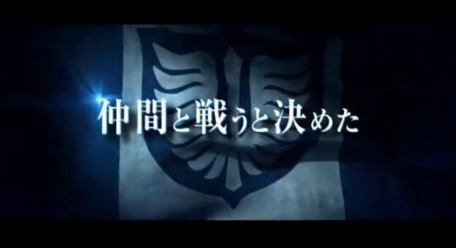
Very simple thing that you guys should probably know by now: How many feathers should the logo have?
22. 11 on each side. NOT EIGHT! on each side.
VERY WRONG!

Why change it for no reason? They think it looks cooler? UGH.....
Also, the smaller logo on their capes/breastplates seems to be simply a different logo, just look at the poster. Surely that will be seen close up, and it's different enough to be called a different logo. Still a Hawks logo, but effort was made into making it different IMHO.
Deci said:This is barely news but this was posted on Clara_de_Porras twitter:
Picture of Adonis, not sure what it says, but the top cover looks a lot like the script to Golden Age I.
Right off the top of my head, I can tell that he's saying something like "Pleased to meet you!!" in the second speech bubble. Unfortunately my very limited Japanese skills won't allow me to recognize the rest of the words

Deci said:
And my browser translated something like "a new character ???" right before the link to the image, that's sorta disturbing...
Yeah, and which "new character" would that be? Kenny McCormick, who is holding Guts' storyboard sketch to the green cardboard? Or that little Neko Majin chilling, safely tucked beneath Guts' cape?
Very disturbing, if either of these two is actually going to be introduced as the new character in the movie

But no, it seems more likely to me that Clara is just letting the fans know that Adonis is the latest character on whom the 4°C animation production team has finished working on, meaning that his animation and/or seiyuu voice recording for the movie has been completed. If that is indeed the case, we can expect to see Adonis' character profile put up on the Berserk film website very soon. And hopefully, perhaps they'll follow it up with Gambino, Skull Knight and kid Guts, along with a slew of other characters who are yet to appear in either the trailers, promo shots or posters

X
Xem
Guest
Señor Caudillo said:But no, it seems more likely to me that Clara is just letting the fans know that Adonis is the latest character on whom the 4°C animation production team has finished working on, meaning that his animation and/or seiyuu voice recording for the movie has been completed. If that is indeed the case, we can expect to see Adonis' character profile put up on the Berserk film website very soon. And hopefully, perhaps they'll follow it up with Gambino, Skull Knight and kid Guts, along with a slew of other characters who are yet to appear in either the trailers, promo shots or posters
I can't tell if you're joking or not.

Either way you're reading way much into a sketch and a partial translation... a bad one. It's probably just an office gag.
Griffith
With the streak of a tear, Like morning dew
Concerning the Falcon logo, though it does speak to the limits of the production, it is indeed relatively insignificant compared to some of the serious inconsistencies we've seen, namely things effecting the plot. The reason I point this out is I don't want those substantive complaints to be equated with something superficial like the lacking quality of the insignia. Frankly, it's frustrating that with all the bigger issues we've seen, this one has caught on in this thread while more significant problems are largely ignored or dismissed. I'd much rather we talk about how almost everything we've seen has been notably altered, how the '97 anime we condemn for lack of faithfulness looks downright reverent by comparison, or why some overlook or ignore these things and treat this adaptation more sacrosanct than, ya know, the original story.
RaffoBaffo
Ex-Newser of the late Berserk Chronicles
Sachiel from Evangelion: http://29.media.tumblr.com/tumblr_lfyo50vouL1qe0rnyo1_400.jpgSeñor Caudillo said:Yeah, and which "new character" would that be? Kenny McCormick, who is holding Guts' storyboard sketch to the green cardboard?
Or Lilith from Rebuild of Evangelion: http://img156.imageshack.us/img156/406/utwthoraevangelion222yo.png
Don't get your feathers all ruffled! Miura's own design for the logo changes over time. Check this image out from volume 23, when Guts reflects on Midland disappearing. Versus a much earlier appearance here in volume 6.Deci said:Sword should be wider, the hilt wider and it should extend much farther down. Logo in general is skinnier.
Very simple thing that you should have probably checked before you posted: it varies. Sometimes it's 9 feathers per side. Sometimes it's 11. Nothing to get all nerdy over. In this image, from volume 8, there are 9 per side. I also counted one in the background here that has 8 feathers. And one that looks like the one from the Saga project. It also doesn't mean very much...Very simple thing that you guys should probably know by now: How many feathers should the logo have?
22. 11 on each side. NOT EIGHT! on each side.
VERY WRONG!
Wholeheartedly agree. I really didn't intend for the logo to become this big of an issue. I imagine it's just an easy one to grasp, but there are indeed much bigger changes in store for the saga.Griffith said:Concerning the Falcon logo, though it does speak to the limits of the production, it is indeed relatively insignificant compared to some of the serious inconsistencies we've seen, namely things effecting the plot. The reason I point this out is I don't want those substantive complaints to be equated with something superficial like the lacking quality of the insignia. Frankly, it's frustrating that with all the bigger issues we've seen, this one has caught on in this thread while more significant problems are largely ignored or dismissed. I'd much rather we talk about how almost everything we've seen has been notably altered, how the '97 anime we condemn for lack of faithfulness looks downright reverent by comparison, or why some overlook or ignore these things and treat this adaptation more sacrosanct than, ya know, the original story.
Dar_Klink
Last Guardian when? - CyberKlink 20XX before dying
Walter said:PS: And the character art on the inside jacket of Vol 5 shouldn't count!
 I was just going to post it(with a disclaimer that it shouldn't count anyway)
X
Xem
Guest
Heh, my apologies about the logo, particularly to Lith, it's been a long week (0 hours of sleep last night doesn't help). Thanks for correcting me Walter, and taking the time to link the images. I feel pretty dumb... Though it still bothers me, some of that is due to my choice of body art.
Still though, I think there's a "more official" version, like I was describing, and little things like this sometimes will bother me more than the bigger picture. What if they mess around with the Brand? Or Guts' nose scar? Or what eye of his is closed post-Eclipse? etc etc.
It's unsettling also because I assume this animation team is well aware of how fanatical the core fan base for Berserk is. We're the people that'd go see the movie 15+ times if it did the series justice, ya know? You'd think they'd be a bit more cautious with this shit.
Trying to put my nerd rage aside for a while, I'm losing my mind.
....
On a side note, I find it kinda sickening that the sketch I posted above of Guts would've been a better image to use on the poster than the one we have currently. Let's hope this doesn't turn out to be the one that becomes most associated with the trilogy/movie. We'll see I suppose.
Lithrael said:It's as simple as 'we can save x amount of hours and time by not drawing it right except in closeups' and it's not a detail I can be angry with them for sacrificing.
I'm not sure it's much of a gain of time to not draw it properly. Furthermore, it's on 3D models, isn't it? So they'd just have to do it once and it'd be good forever. Just sayin'.
Señor Caudillo said:Yeah, and which "new character" would that be? Kenny McCormick, who is holding Guts' storyboard sketch to the green cardboard? Or that little Neko Majin chilling, safely tucked beneath Guts' cape?
Very disturbing, if either of these two is actually going to be introduced as the new character in the movie
Was just a joke from Clara and it refers to the critter in Guts' cape. If you people are going to post stuff from Twitter at least read all the messages.
Deci said:It's unsettling also because I assume this animation team is well aware of how fanatical the core fan base for Berserk is. We're the people that'd go see the movie 15+ times if it did the series justice, ya know? You'd think they'd be a bit more cautious with this shit.
Not any more fanatical than any other core fan base, frankly. Probably less so than most, as a matter of fact.
Griffith said:Concerning the Falcon logo, though it does speak to the limits of the production, it is indeed relatively insignificant compared to some of the serious inconsistencies we've seen, namely things effecting the plot. The reason I point this out is I don't want those substantive complaints to be equated with something superficial like the lacking quality of the insignia. Frankly, it's frustrating that with all the bigger issues we've seen, this one has caught on in this thread while more significant problems are largely ignored or dismissed. I'd much rather we talk about how almost everything we've seen has been notably altered, how the '97 anime we condemn for lack of faithfulness looks downright reverent by comparison, or why some overlook or ignore these things and treat this adaptation more sacrosanct than, ya know, the original story.
That bears repeating.
Lithrael
Remember, always hold your apple tight
Aazealh said:I'm not sure it's much of a gain of time to not draw it properly. Furthermore, it's on 3D models, isn't it? So they'd just have to do it once and it'd be good forever. Just sayin'.
Any occasion where it is hand drawn it makes a ginormous difference having a simpler shape to draw rather than a more complex one, if you can get away with it. Any occasion where it's CG it'll want to agree with the hand drawn version at whatever level of detail. Also the problem with over-detailing your work and then shrinking it down is that, if your resolution is too low for the detail, you get problems with clear readability, and if your resolution *does* carry the detail, you've still got trouble with that bit of hyper-detail not matching the level of detail in the rest of the drawn scene. It looks better if it all matches.
However, given that they're making it up when it's a banner taking up the whole screen, the point is kinda moot.
Lithrael said:Any occasion where it is hand drawn it makes a ginormous difference having a simpler shape to draw rather than a more complex one, if you can get away with it.
Are they getting away with it though? In the end it looks pretty sloppy in the shots where it's clearly visible. We're not talking about bandages on a sword handle or laces on a boot or something like that, but an insignia stuck on the chest of the main characters. I'd say that at some point "saving time" has to take a backseat to things looking good, but that's just me. Anyway it's not the end of the world, but piled on top of everything else I can see how it annoys people.