You are using an out of date browser. It may not display this or other websites correctly.
You should upgrade or use an alternative browser.
You should upgrade or use an alternative browser.
CnColors
- Thread starter CnC
- Start date
Raziel
"Each man is haunted until his humanity awakens."
Good color choices and nice job on the wings and texturing of the whole picture. I especially like Zodd's eye in the closeup shot, since the highlight on it along with the careful coloring detail you paid to it really gives you the impression of an actual eye.
Keep up the good work.
Keep up the good work.
TheSkyTraveller
Monster adventures on the high seas!
Just spent the last half hour checking these out. You've got some wonderful stuff in here, especially the tiger and Flora's house. I'm also partial to the Farnese one, even though you said you weren't completely satisfied with it. I like the palette you chose, and the understated but effective way you colored it.
The only nitpicky crit I can offer is, on your more saturated pieces with a strong light source and contrast, like the tiger and Blaze Rod, is sometimes I feel like the shadows are a little too black and muddy. I also know that black is a standard shadow color to use when coloring comics, so it might be a personal preference of mine to like to see shadow colors complement the color of light.
The lighting and fur on that tiger....man, that just looks awesome! First thing that wowed me on that one.
thanks for the comments Sky (and Raziel). I'm glad you enjoyed the pics.
Thanks for the crit!
I try to mix complements in my shadows whenever possible. I most definitely agree that they can get muddy sometimes (the blaze rod was definitely an example). You're right about a black preference in comics. It really depends on the page (or artist, if you're not doing miura's stuff). The problem I had with the tiger page was it was a bad scan (there was severe banding), so that needed to be fixed/covered.
Thanks again.
TheSkyTraveller said:The only nitpicky crit I can offer is, on your more saturated pieces with a strong light source and contrast, like the tiger and Blaze Rod, is sometimes I feel like the shadows are a little too black and muddy. I also know that black is a standard shadow color to use when coloring comics, so it might be a personal preference of mine to like to see shadow colors complement the color of light.
Thanks for the crit!
I try to mix complements in my shadows whenever possible. I most definitely agree that they can get muddy sometimes (the blaze rod was definitely an example). You're right about a black preference in comics. It really depends on the page (or artist, if you're not doing miura's stuff). The problem I had with the tiger page was it was a bad scan (there was severe banding), so that needed to be fixed/covered.
Thanks again.
1800 posts hit! Picture's Due.
Tricky lighting on this one. But it had to be done. :)
Enjoy:

"This one can!"
Wallpaper:
FULL REZ (clickyclicky)
Tricky lighting on this one. But it had to be done. :)
Enjoy:
"This one can!"
Wallpaper:
FULL REZ (clickyclicky)
Truly sweet. Zodd's teeth especially catch my eyes. Must be the slight blue tinge to the edges. Only comment would be that, for some reason, I feel like the lightning in the breech in Ganishka's head (or maybe his head itself) should be differentiated from Guts and Zodd. Maybe it feels too "present" by contrast with the foreground, if that makes any sense.
mahlernut said:Truly sweet. Zodd's teeth especially catch my eyes. Must be the slight blue tinge to the edges. Only comment would be that, for some reason, I feel like the lightning in the breech in Ganishka's head (or maybe his head itself) should be differentiated from Guts and Zodd. Maybe it feels too "present" by contrast with the foreground, if that makes any sense.
I think I see what you mean. When trying to push the forground I lowered the intesity of the lighting in the distance and removed its glow. But theres only so far I can push it before it doesn't look like lightning anymore.
Like I said, tricky.
Griffith
With the streak of a tear, Like morning dew
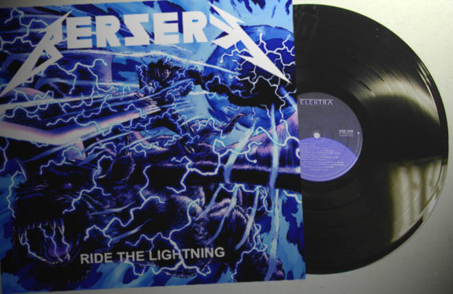
Coincidentally, look what I found at my local record store today!

Anyway, that's awesome as expected CnC, and so fast I didn't even notice you had posted it already. I have the opposite opinion on the lightning, I think it looks great in the foreground and wouldn't look much different only a few meters away (background be damned), and aside from that the only curiosity I have is that the areas around the "wound" are are almost as dark as the area inside the hole. Assuming that's also Ganishka's mist, shouldn't it be lighter? Also, it's fun to turn the contrast and brightness up and down in photoshop like they're getting electrocuted, look cool too. More kudos for that.
Anyway, that's awesome as expected CnC, and so fast I didn't even notice you had posted it already. I have the opposite opinion on the lightning, I think it looks great in the foreground and wouldn't look much different only a few meters away (background be damned), and aside from that the only curiosity I have is that the areas around the "wound" are are almost as dark as the area inside the hole. Assuming that's also Ganishka's mist, shouldn't it be lighter? Also, it's fun to turn the contrast and brightness up and down in photoshop like they're getting electrocuted, look cool too. More kudos for that.
"Griffith No More!" said:http://www.skullknight.net/griffith/berserkrecordlow.jpg
Wow!
I'd buy that in a heart beat if that was on CD! BTW CnC Awesome colors 
CnC said:"This one can!"
Great stuff dude, I wouldn't change anything (except maybe the color shade on the DS' blade).
 And nice record too Griff.
 Wow guys, I'm loving these crits! And thanks for the comments.
Done. (Also attached it to the original message)
Thanks for thinkin' highly enough of it to use it. cheers
Frickin' sweet, griff. :) I've finally achieved metal album cover status.
Yea I was kinda debating that for a while. I would have reversed the lighting on the background mist (ouside dark, inside bright) but the inks Miura laid down seem to imply that there was shading inside the hole. Meh, who am I to argue.
Thanks fellas. A heated up blade was kinda what I was goin' for. Or at the very least given some kind of color significance ("this one can", and all).
grendelrt said:And as always, can I get the source to make a desktop BG out of it
Done. (Also attached it to the original message)
Thanks for thinkin' highly enough of it to use it. cheers
"Griffith No More!" said:Coincidentally, look what I found at my local record store today!
Frickin' sweet, griff. :) I've finally achieved metal album cover status.
"Griffith No More!" said:and aside from that the only curiosity I have is that the areas around the "wound" are are almost as dark as the area inside the hole. Assuming that's also Ganishka's mist, shouldn't it be lighter?
Yea I was kinda debating that for a while. I would have reversed the lighting on the background mist (ouside dark, inside bright) but the inks Miura laid down seem to imply that there was shading inside the hole. Meh, who am I to argue.
Aazealh said:Great stuff dude, I wouldn't change anything (except maybe the color shade on the DS' blade).
vlad said:Wonderfull, well wort the 3 minutes it took for my dial-up to handle it. I especially like the reddish tones on the DS, makes it look all heated up.
Thanks fellas. A heated up blade was kinda what I was goin' for. Or at the very least given some kind of color significance ("this one can", and all).
Black_Devil
Punos Rey
Oh man, what a terrific color CnC, this is your first work I've commented on, it's absolutely wonderful  and easily became my new wallpaper
and easily became my new wallpaperhandsome rakshas
Thanks Grail!
Fantastic! I imagined how this one would look colored and CnC went above my expectations! And he was pretty quick about it too! Another masterpiece. 
