You are using an out of date browser. It may not display this or other websites correctly.
You should upgrade or use an alternative browser.
You should upgrade or use an alternative browser.
Berserk Character studies
- Thread starter vee209
- Start date
http://i252.photobucket.com/albums/hh30/vee209/Berserk%20Studies/SerpicoandFarnese-imprimatura2.jpg
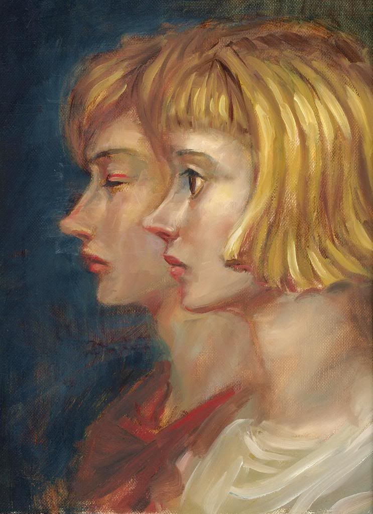
I tried to change Farnese's nose a bit. Will need more highlight afterwards. Does it look any better at all? The neck is going to be a bit of a problem.. hmm. Any other alteration needed?
Many thanks.
I tried to change Farnese's nose a bit. Will need more highlight afterwards. Does it look any better at all? The neck is going to be a bit of a problem.. hmm. Any other alteration needed?
Many thanks.
the nose looks better (the front of those is probably supposed to be a liiiiiittle more pointed tho), as does the lower lip. What Aaz might be pointing to is the transition between the jaw and the neck. Typically Miura doesn't render or indicate shadow in the actual jawline, but does indicate it from the jaw to the heck. This is actually typical of many people who draw in an anime style. On yours you have that shading which is making it look a bit wierd, as if their jaws are very high up. This is one of the ways that differentiates eastern and western style if comic illustration. Miura defines his faces more than others but even still doesn't usually show all that much form in the faces. It can make it very hard to depict the characters in 3 dimensions (as AOW and those of us who have attempted doing these characters in 3d can probably attest to).
Also the curve that bridges the neck to the chin isn't as sharp in the manga as you've got it depicted here. That also might be what Aaz was noticing.
Also the curve that bridges the neck to the chin isn't as sharp in the manga as you've got it depicted here. That also might be what Aaz was noticing.
vee209 said:I did a quick sketch of Sonia today.
http://i252.photobucket.com/albums/hh30/vee209/Berserk%20Studies/Sonia3.jpg
Very nice, you got her forehead right I think.
 Hmm, the right eye might be a little misplaced though, it seems a tad far from her nose to me. It's probably because of the perspective.
Been trying to work on this fighting scene which I've done previously..
http://i252.photobucket.com/albums/hh30/vee209/Berserk%20Studies/rider.jpg
This is the new composition. Do you think it would work? I want it to be bright in the centre and very dark surrounding. Haven't had a chance to draw it properly yet.
http://i252.photobucket.com/albums/hh30/vee209/Berserk%20Studies/fight.jpg
vee209 said:Been trying to work on this fighting scene which I've done previously..
http://i252.photobucket.com/albums/hh30/vee209/Berserk%20Studies/rider.jpg
This is the new composition. Do you think it would work? I want it to be bright in the centre and very dark surrounding. Haven't had a chance to draw it properly yet.
http://i252.photobucket.com/albums/hh30/vee209/Berserk%20Studies/fight.jpg
I like the composition of the second better than the first. Guts' pose and the position of the DS looks a bit flat, imo. Also, while this is just a sketch and I know it's rough, mind the structure and position of the hands and feet and, once again, Zodd's shoulder and elbow. Also the horse's head seems a bit small and thin (could be wrong, tho).
vee209 said:This is the new composition. Do you think it would work? I want it to be bright in the centre and very dark surrounding. Haven't had a chance to draw it properly yet.
The main problem I have with this is that Guts couldn't parry Zodd's strike in his position, so you're basically drawing him 2 seconds before his death.
Oh, come now, we all know Guts always finds a way to surviveAazealh said:The main problem I have with this is that Guts couldn't parry Zodd's strike in his position, so you're basically drawing him 2 seconds before his death.
The sketches are all great. Fabulous work, man. They bring a professional look to Berserk fanart.

 I still think the necks are too long though.
Now that is sexy!
I want more.
I want more.
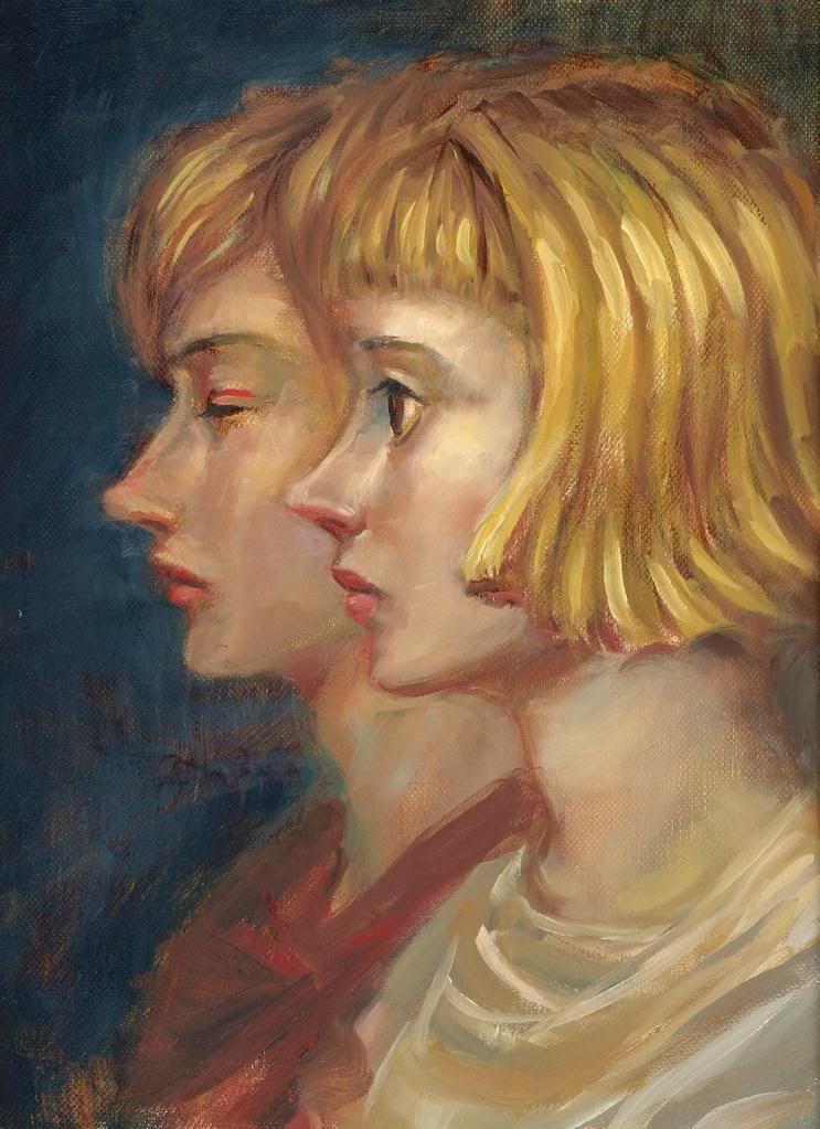
vee209 said:I do agree that the neck is a bit too long. Here is the correction..
Nice fix! You might kill me but I think they're a still little too long.
However it's already very good as it is, so don't mind me. Again, very good job.I have finiesed the painting of Zodd but will have to wait for it to dry first.. Will post it soon.
My next project.. I want to do a portrait of Sonia. This is one sketch I did today. I still feel that there are a few things that need correcting but can't quite pinpoint them. Hope you guys can help. Many thanks in advance.
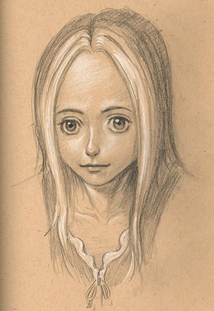
My next project.. I want to do a portrait of Sonia. This is one sketch I did today. I still feel that there are a few things that need correcting but can't quite pinpoint them. Hope you guys can help. Many thanks in advance.
Actually I'd like to comment on the oil painting. A few things stand out to me no one has mentioned.
Farnese's hair looks strange, like it's divided into two major parts (lower and upper.) It's like you realized the scalp was too small so you made it bigger. As a result they don't blend together very naturally.
And the red streak over Serpico's eye bugs me. I know you intentionally put it in but I don't understand why. It doesn't seem right to me.
Either that or it's supposed to be blending with Serpico's scalp but then it makes even less sense to me.
Also, it isn't that her neck is too long, it's that her shoulders and collar are disproportionate. If her right shoulder (left side from our perspective) came out a little wider it would be perfect.
I hate to complain because I couldn't even remotely hope to come close to anything nearly as beautiful. I've studied art in general for many years but painting is the media I'm personally worst at, so I feel I have no right. I hope you understand that my opinions are just opinions. I don't expect you to go back and fix it, just hoping that if you agree with me you'll learn.